HUT HOUSE
Holiday house
Client : Private
Location : Shimoda, Shizuoka, Japan
Program : Housing
Area : 120m2
Scope : Design, PM
Year : 2022
Status : Budgetting
[Click on the image to enlarge]
This is a nostalgic project. While talking with the client and spending time at this wonderful site, the image of a hut as described in a children’s book kept coming to my mind. As we walked amidst the dense undergrowth on a spring day, I imagined a hut, hidden, deep in a dark forest or on an uninhabited island, ready for adventure.
Somehow the images one has as a child remain strongest throughout life. Thinking back on my summer as a ten-year-old what comes to mind are the hours of playing on the beach, eating ice cream out of colourful plastic coconut-shaped containers, lazying around in hammocks and sleep-overs in a small garden hut in a friend’s large garden. These “hut-memories” are some of the strongest impressions I have of my childhood.
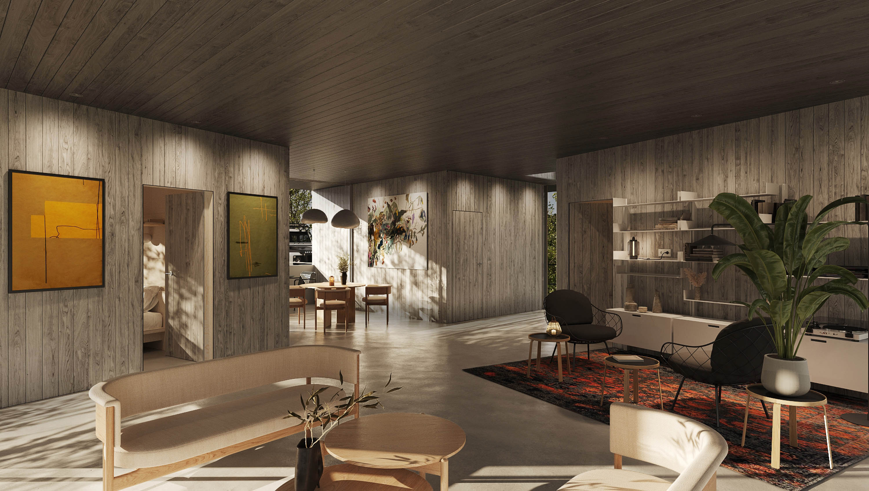
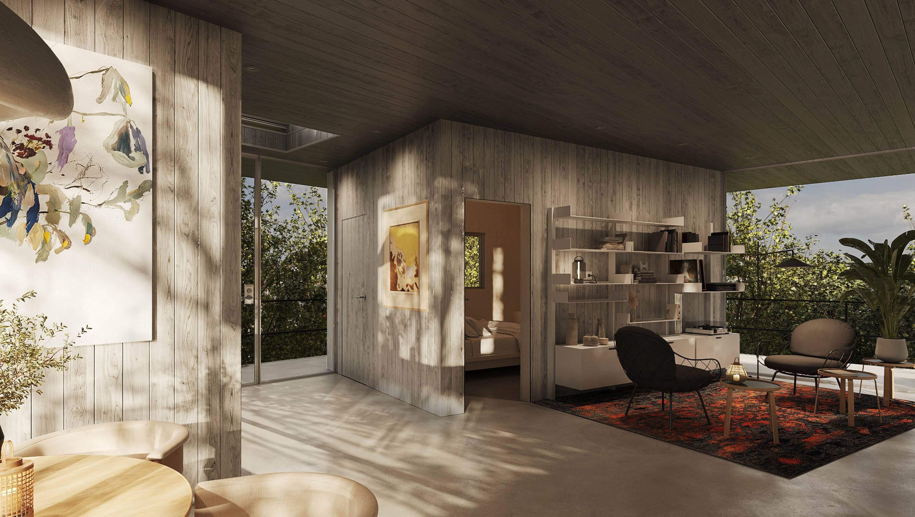
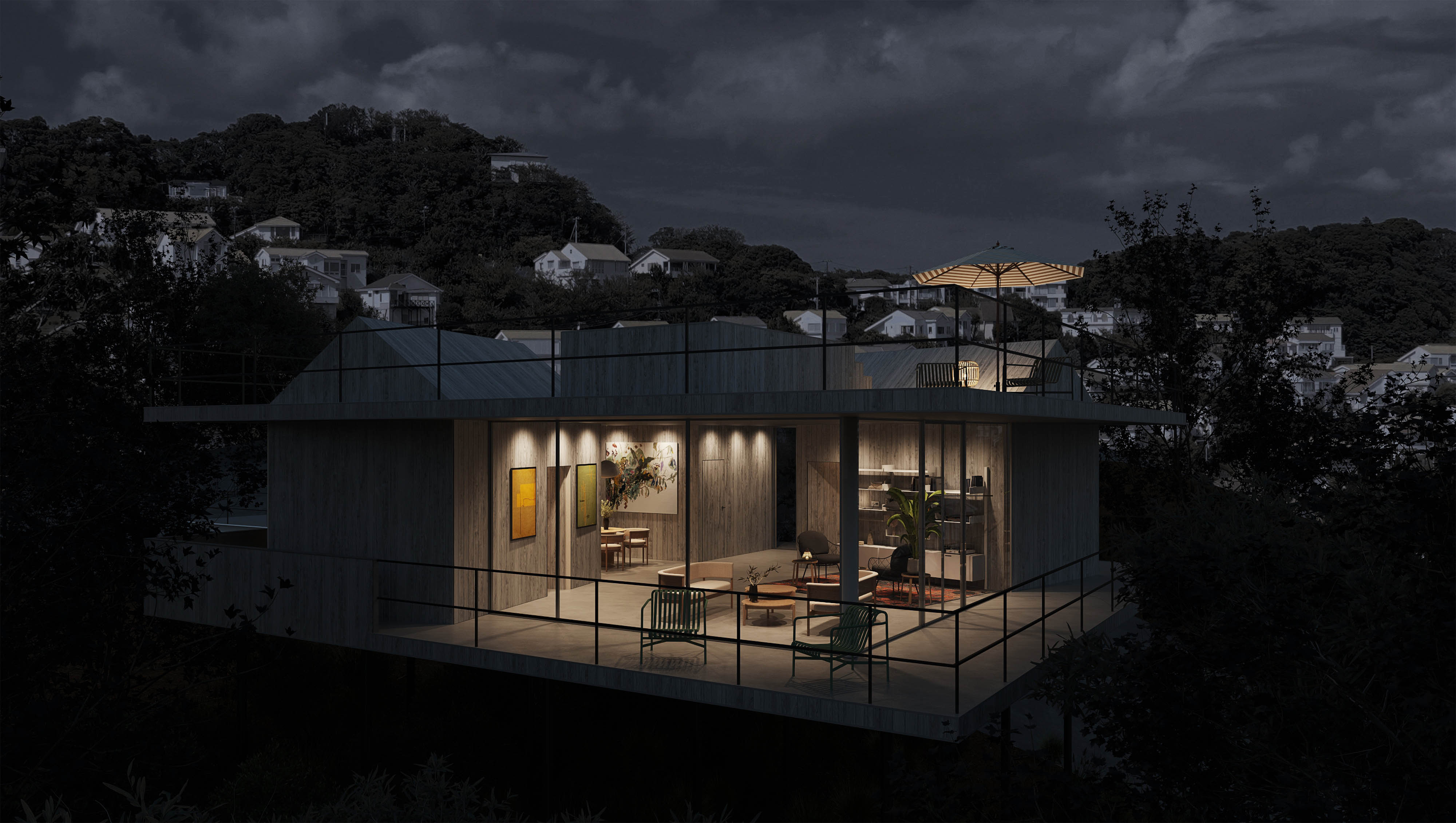
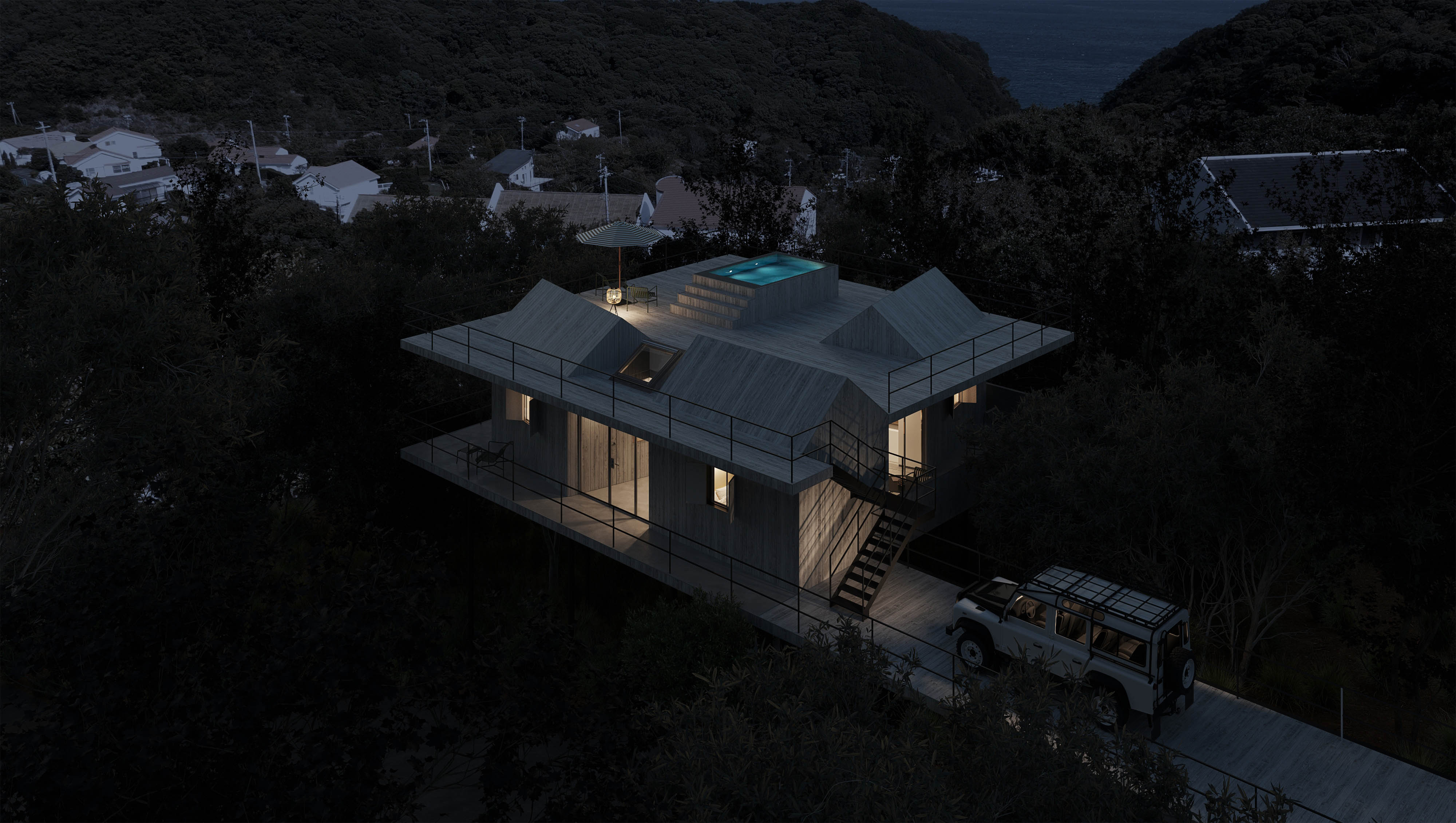
The Shimoda Hut House is as the name suggests: a collection of three huts placed on a platform looking out over Shimoda Bay. The programme dictated these huts spontaneously; the client is renting out his house to Airbnb clients. There is a need for privacy for three couples as well as a social function to spend time together. The limited construction budget suggested a platform to bridge the steep slope onto which the project is set. This platform then provides the basis for the three pre-fabricated huts that also support the roof terrace above.
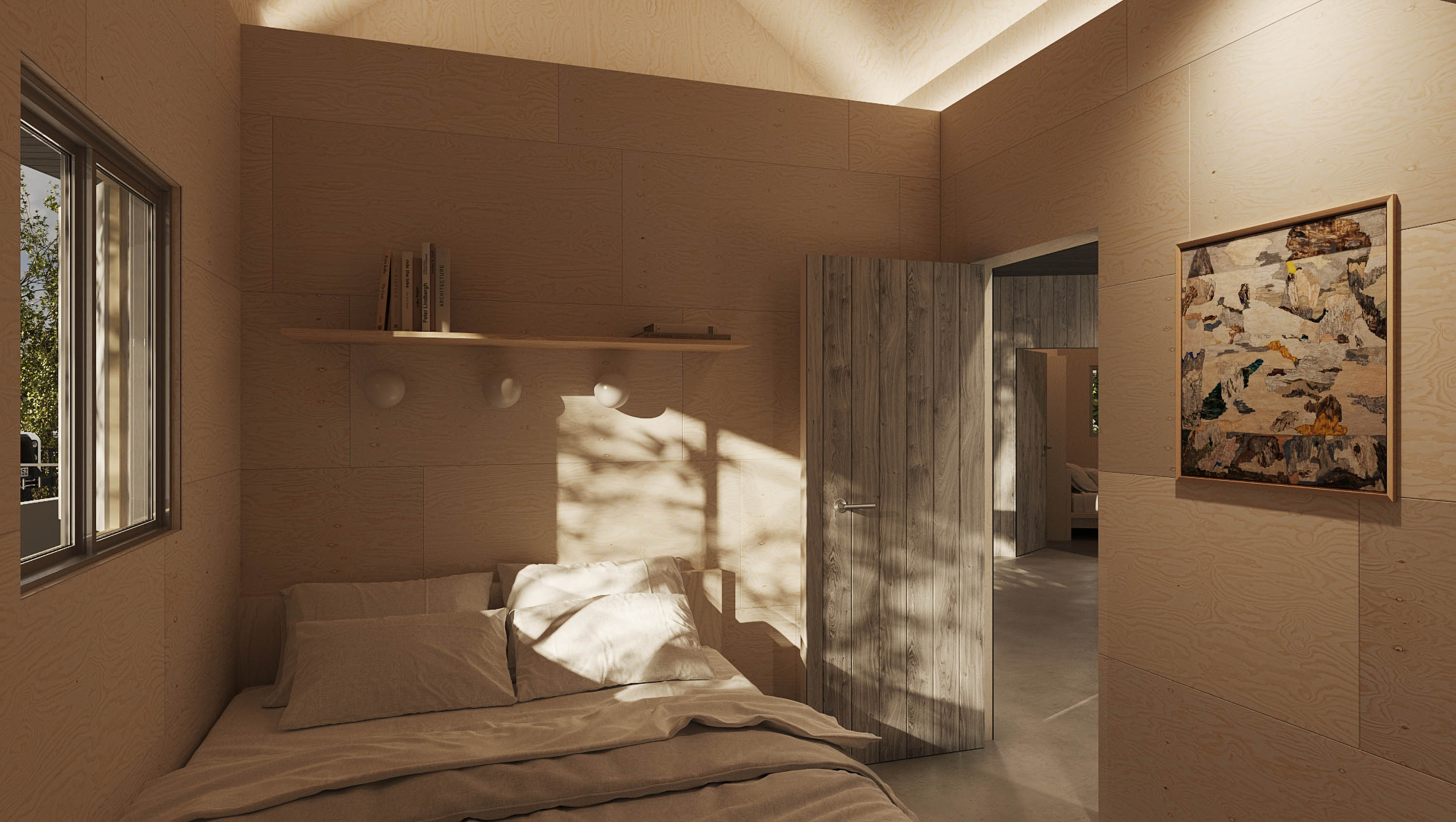
The huts are self-contained guest rooms with a queen-size bed and shower and sink. A bunk bed is placed above the bathroom. Each hut has an exterior window with a distinct view and a small private terrace. The position of the huts creates nooks within the common space in which a kitchen with a round dining table, a library and a seating area are placed. An exterior staircase gives access to a large roof terrace with 360-degree views. The roofs of the huts punctuate the terrace adding to the dream-like nature of this project.
Somehow the images one has as a child remain strongest throughout life. Thinking back on my summer as a ten-year-old what comes to mind are the hours of playing on the beach, eating ice cream out of colourful plastic coconut-shaped containers, lazying around in hammocks and sleep-overs in a small garden hut in a friend’s large garden. These “hut-memories” are some of the strongest impressions I have of my childhood.
The Shimoda Hut House is as the name suggests: a collection of three huts placed on a platform looking out over Shimoda Bay. The programme dictated these huts spontaneously; the client is renting out his house to Airbnb clients. There is a need for privacy for three couples as well as a social function to spend time together. The limited construction budget suggested a platform to bridge the steep slope onto which the project is set. This platform then provides the basis for the three pre-fabricated huts that also support the roof terrace above.
The huts are self-contained guest rooms with a queen-size bed and shower and sink. A bunk bed is placed above the bathroom. Each hut has an exterior window with a distinct view and a small private terrace. The position of the huts creates nooks within the common space in which a kitchen with a round dining table, a library and a seating area are placed. An exterior staircase gives access to a large roof terrace with 360-degree views. The roofs of the huts punctuate the terrace adding to the dream-like nature of this project.
これは懐かしいプロジェクトです。クライアントと話し、素晴らしい場所で時間を過ごしているうちに、子供の本に描かれた小屋のイメージが私の頭に浮かびました。春の日、密集した林の中を歩きながら、冒険の準備ができた暗い森の奥深くや無人島に隠れた小屋を想像しました。
なぜか、子供の頃のイメージは一生忘れられないものです。私が10歳の夏に思い出すのは、ビーチで遊び、カラフルなプラスチックのココナッツ型の容器からアイスクリームを食べ、ハンモックでのんびりしたり、友達の広い庭にある小さな庭の小屋で寝泊まりした時間です。これらの「小屋の思い出」は、私が子供の頃に持っていた強い印象の一部です。
下田のハットハウスは、その名が示すように、下田湾を一望できるプラットフォーム上に配置された3つの小屋の集合体です。プログラムにはこれらの小屋が必要で、クライアントは彼の家を民泊のクライアント用に貸し出す予定です。3組のカップルにはそれぞれプライバシーが必要であり、一緒に時間を過ごすための社交場所も必要です。限られた建設予算から、プロジェクトが設置される急斜面を橋渡しするプラットフォームが提案されました。このプラットフォームは、屋根の上にある3つのプレハブ小屋の基礎を提供します。
ハットは、クイーンサイズのベッド、シャワー、シンクを備えた自己完結型のゲストルームです。バスルームの上には二段ベッドが配置されています。各ハットには独特の景色を望む外窓と小さなプライベートテラスがあります。ハットの位置は、ラウンドダイニングテーブル、図書室、シーティングエリアが配置された共通スペース内に隠れ家的な場所を作り出します。外階段からは360度の景色を望む大きな屋上テラスにアクセスできます。ハットの屋根は、このプロジェクトの夢のような性質をより強調しています。
Post-Covid Office
FOCUS ON THE INDIVIDUAL EXPERIENCE AT WORK


Client : Global Consulting Firm
Location : Tokyo, Japan
Program : Office
Area : 3000 sqm
Scope : Design
Status : Built
Photos : Vincent Hecht
[Please click on the picture to enlarge]
Despite the onset of Covid, we continued to design corporate workplaces. For some of those projects, the management premise was that a vaccine would soon signal the return of business back to the Pre-Covid workplace. For those offices, the design included temporary solutions such as physical distancing and other protocols that could be changed once the world would return to normal.
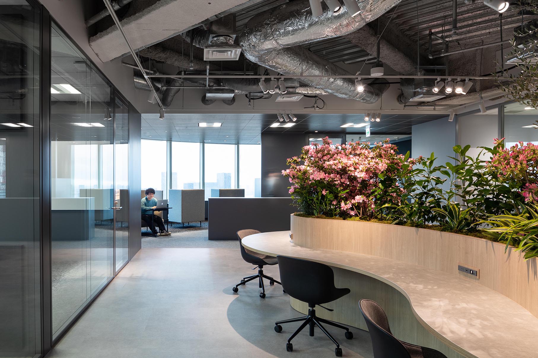
This particular project also started pre-Covid but took a different route. Together with the client, we developed an alternative, holistic, future-orientated approach towards the office. This resulted in a space that is more than just a furniture solution but an integrated conceptual space in which IT, acoustics and lighting design all takes part to form a space in which users can have a choice of how they want to work. The emphasis of this project is on the focus of the individual experience of space.
This project comes to two conclusions:
- The Covid curfew restrictions have shown that most office work is already performed mainly in a digital environment (computer, phone etc…) and is not limited to a specific physical location, work can be done anywhere
- The role of the office is in its communal, social function; a space to bring people together, to express what a company stands for. Thus the importance of design as an expression of an authentic message of how and where a company wants to let their employees work.
コロナ禍の中、私たちはコーポレートオフィスのデザインを続けました。いくつかのプロジェクトは、ワクチンの作成によってコロナ以前のワーキング環境に戻ることを前提としました。このような場合、デザインを考える中で、特に重要視したのはソーシャルディスタンスという点と、世界が再びコロナ以前の通常を取り戻した時に、より速やかに元の環境に戻せる点でした。
このプロジェクトは元はコロナウィルス感染拡大前に始めたものです。あらゆる可能性を踏まえて 全体を捉える、未来志向なアプローチをクライアントと共に考えました。 結果的に、IT、音響、照明の全てが、ユーザーが使いたいように使えるスペースを作り 上げています。このプロジェクトの重点は、一人一人が使いやすいスペースをデザイン する事でした。
コロナ対策の制限や門限により、オフィスワークのほとんどが既にデジタル化されている事を知らされ、仕事は環境を問わないとわかりました。オフィスの役割とは、人々を団結する事であり、その会社の存在を示す事です。よって、オフィスのデザインは、企業が社員にどう仕事をして欲しいのかを率直に表すのです。
IVSL - TOKYO


Client : Confidential
Location : Meguro, Tokyo
Program : Training centre, free-address office
Area : 2000m2
Scope : Design, PM
Year : 2023
Status : Built
Photos : Vincent Hecht
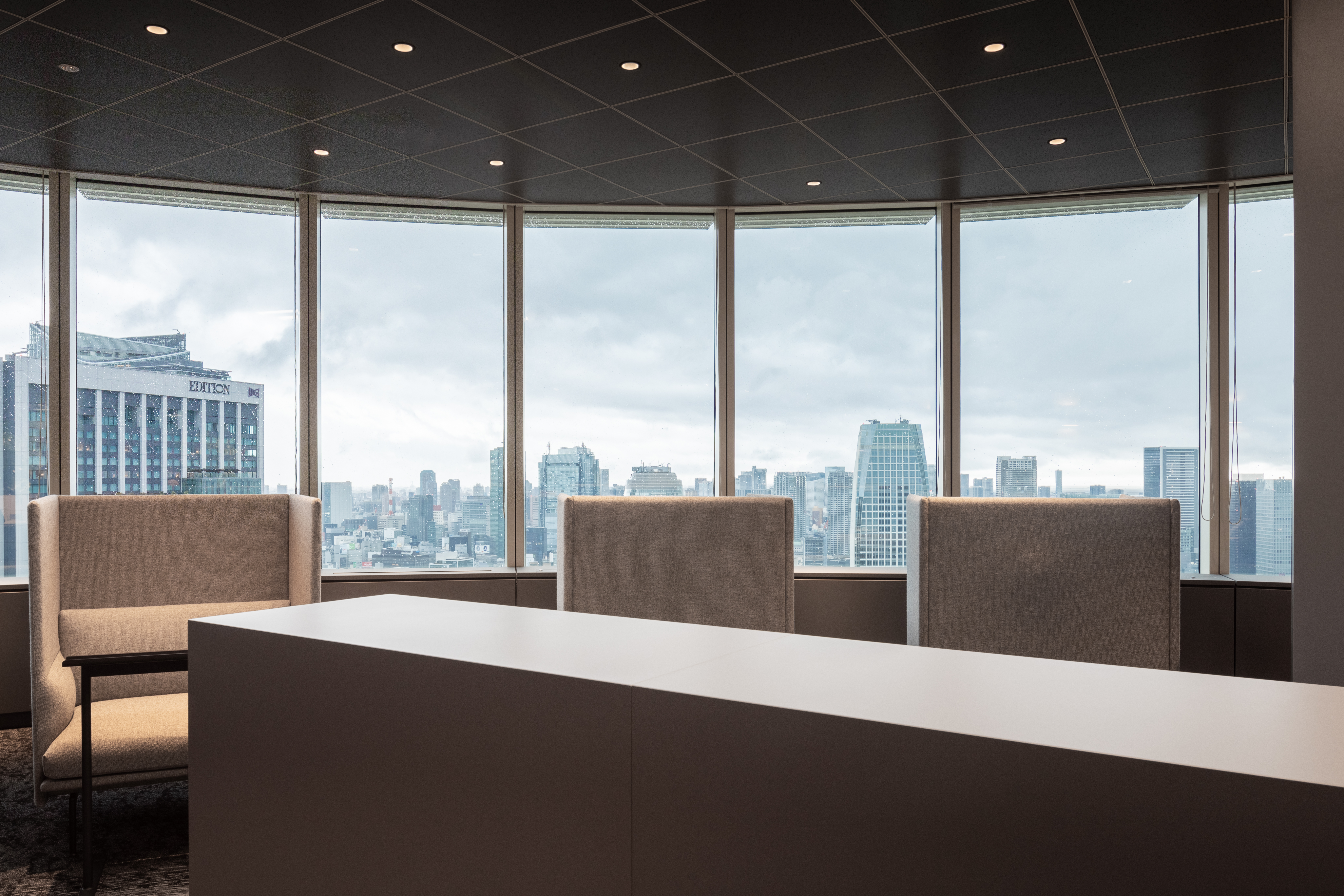
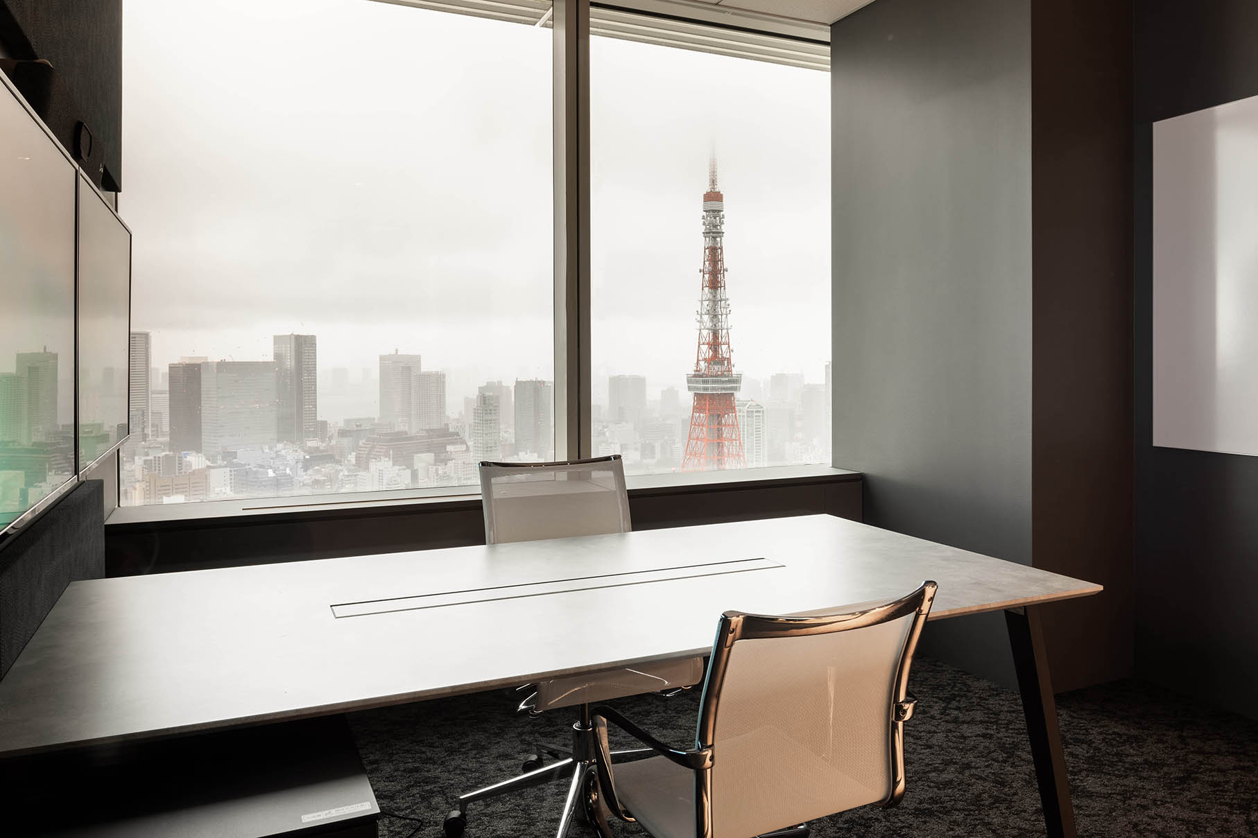
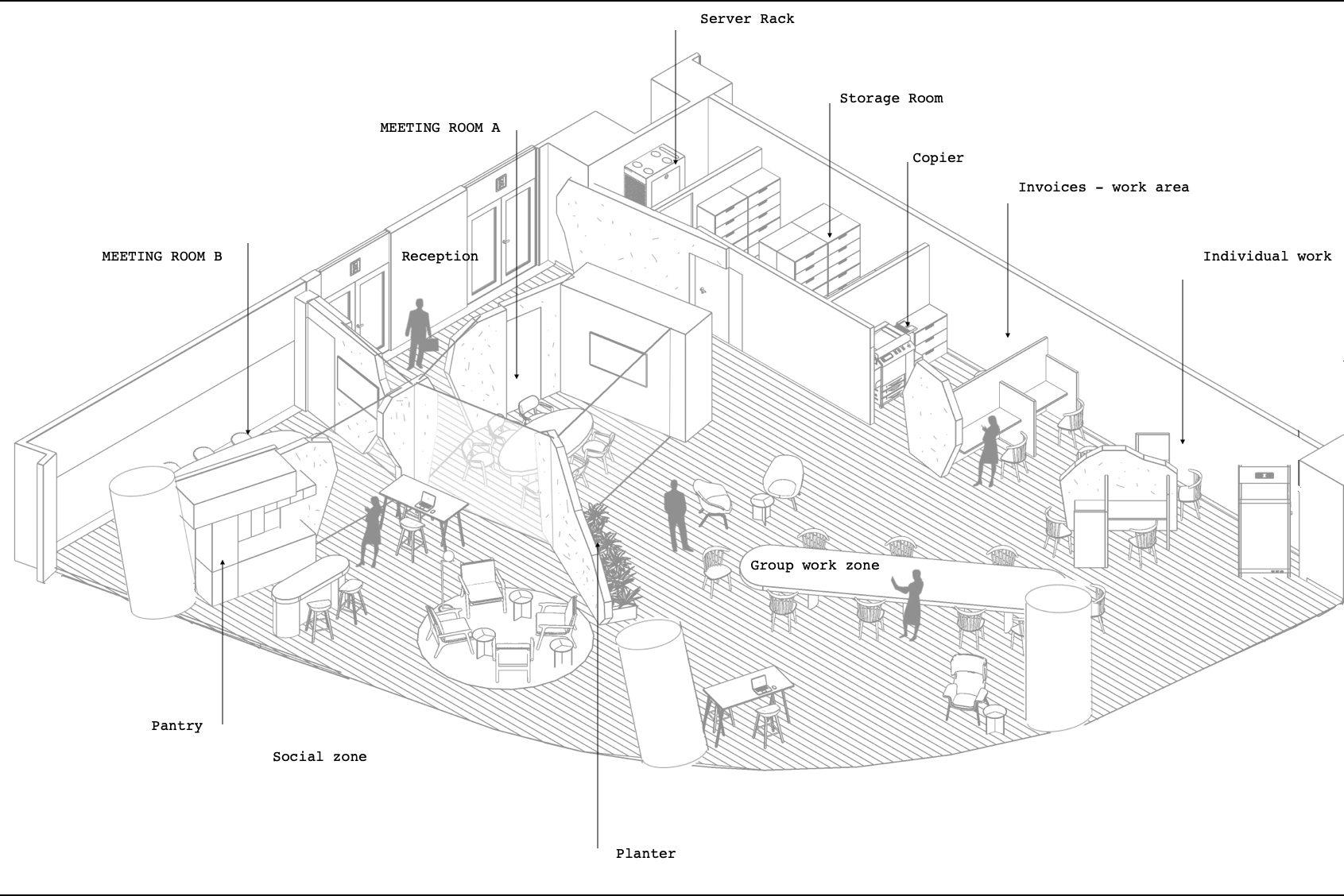
The Dutch architect Rem Koolhaas once mentioned that once the programme is in place the building reveals itself. For this project the programme of three combinable training rooms close to the reception, a call centre, and number of enclosed offices materialised quickly in the plan.
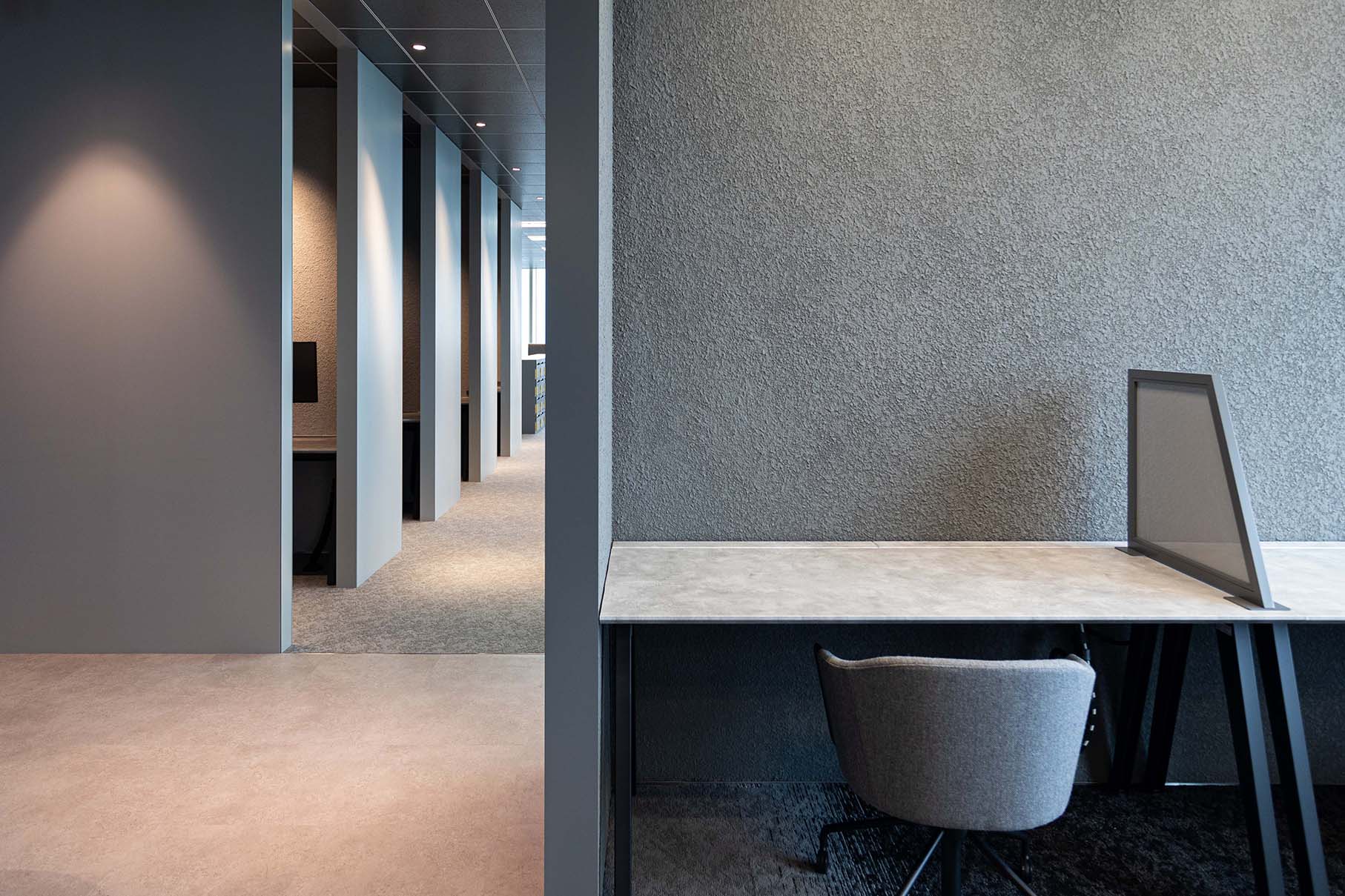
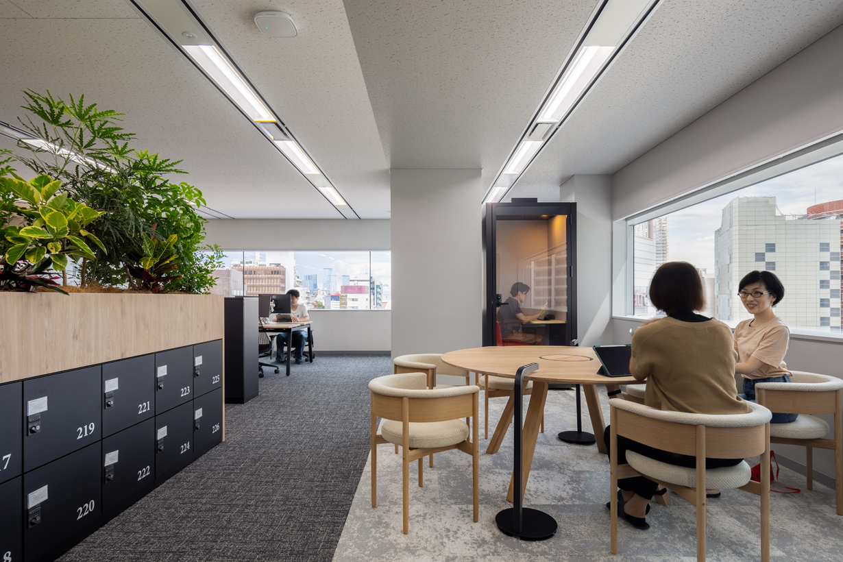
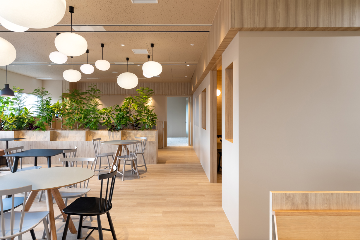
We were left with two large spaces that were to be dedicated as free-address areas. On the eastern side of building structural columns create a difficult to use left-over space. We decided to place phone booths between these columns. Now we have six nooks that can support collaborative team work along the windows. This zone is colour coded in a textured grey carpet, the ceiling is painted in grey as well and most furniture is in a grey shade.
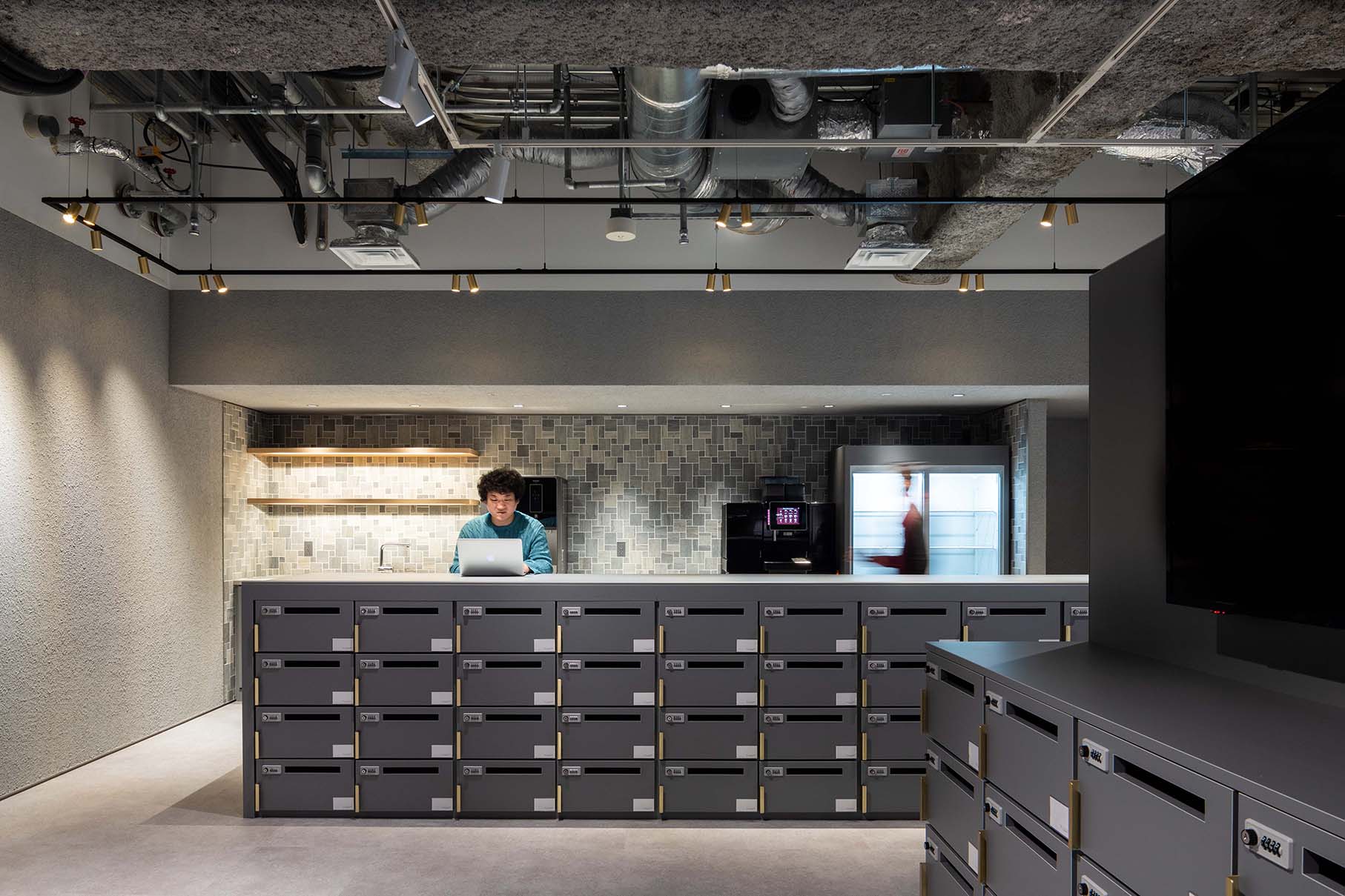
Between the enclosed rooms and the team spaces we placed a series of touch-down desks. We varied both the tables as well as the seating. Some desks have wireless chargers, some desks have stools, while some desks are height adjustable. At the end of the free-address zone we placed a multi-functional cafe- kitchen.
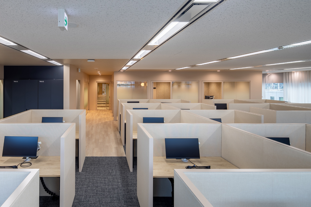
We also created a quiet zone in which all work stations are enclosed with partitions, some desks are height adjustable. As the name suggests, the quiet area is for those who need to focus on their task without the disturbance of noise or telephone calls.
We were left with two large spaces that were to be dedicated as free-address areas. On the eastern side of building structural columns create a difficult to use left-over space. We decided to place phone booths between these columns. Now we have six nooks that can support collaborative team work along the windows. This zone is colour coded in a textured grey carpet, the ceiling is painted in grey as well and most furniture is in a grey shade.
Between the enclosed rooms and the team spaces we placed a series of touch-down desks. We varied both the tables as well as the seating. Some desks have wireless chargers, some desks have stools, while some desks are height adjustable. At the end of the free-address zone we placed a multi-functional cafe- kitchen.
We also created a quiet zone in which all work stations are enclosed with partitions, some desks are height adjustable. As the name suggests, the quiet area is for those who need to focus on their task without the disturbance of noise or telephone calls.
Hoegh - Autoliners
AN OFFICE WITHOUT WALLS


Client : Hoegh Autoliners
Location : Tokyo, Japan
Program : Post-covid Office
Area : 265m2
Scope : Design - Project Management
Status : Built
Photos : Vincent Hecht
[Please click on the picture to enlarge]
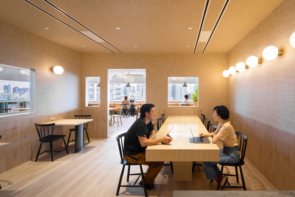
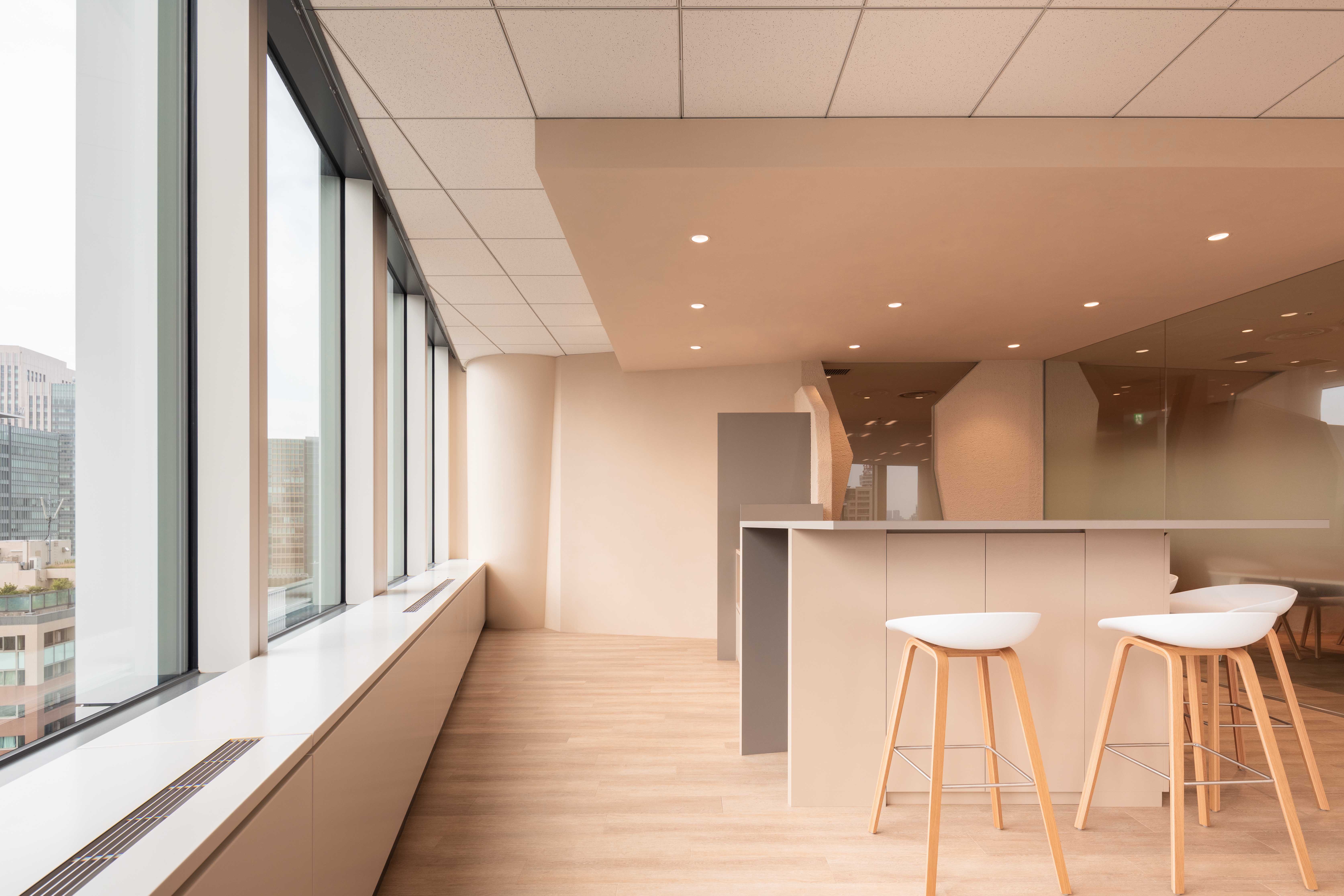
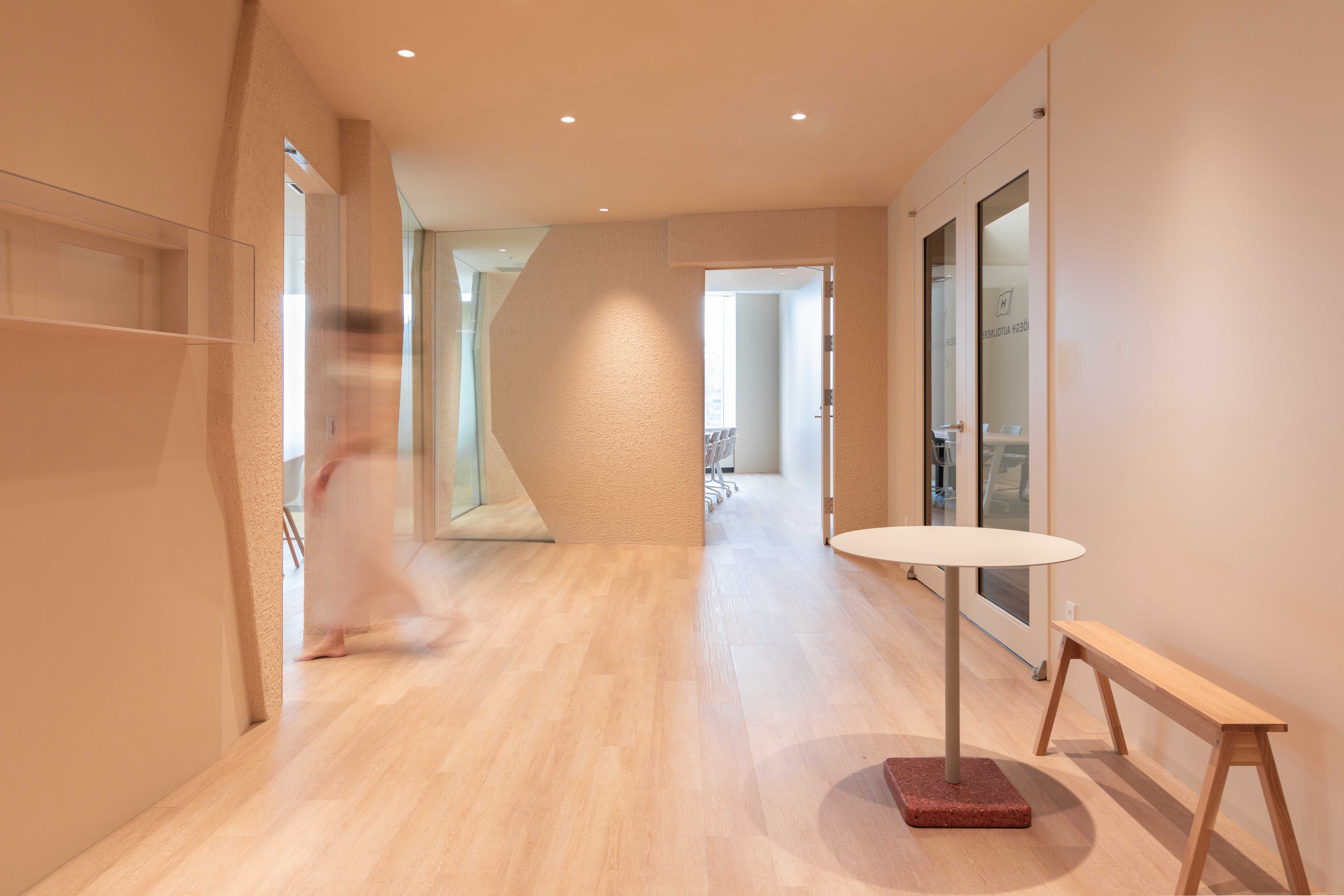
This shipping company had seen our work and wanted something different for their offices as well. Their brief asked for a Futuristic Office Space, that reflected their Norwegian Maritime Heritage and that would still look fresh after 10 years.
We translated these requests around 4 conceptual keywords which would form the basis for the design.
1. Bright:
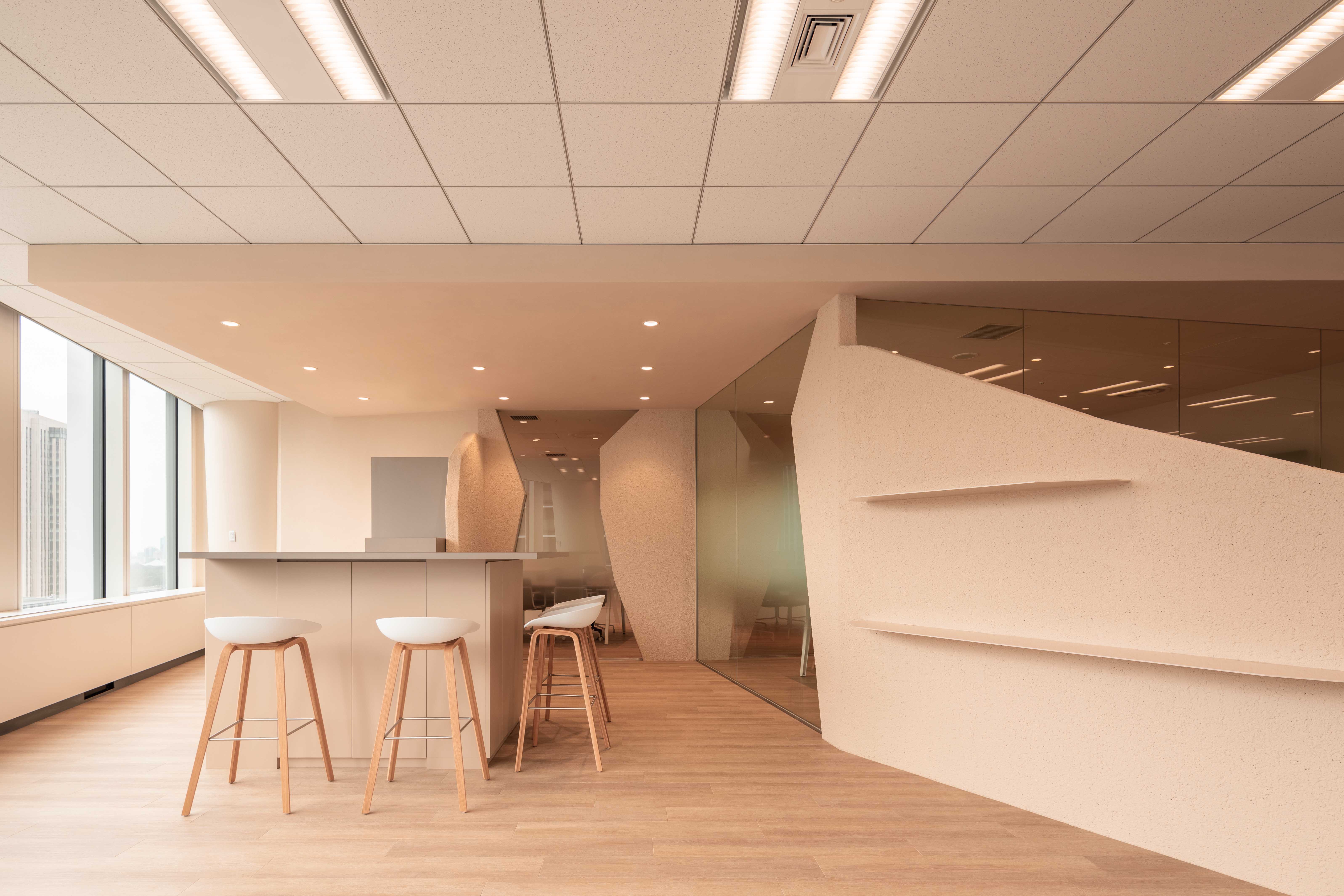
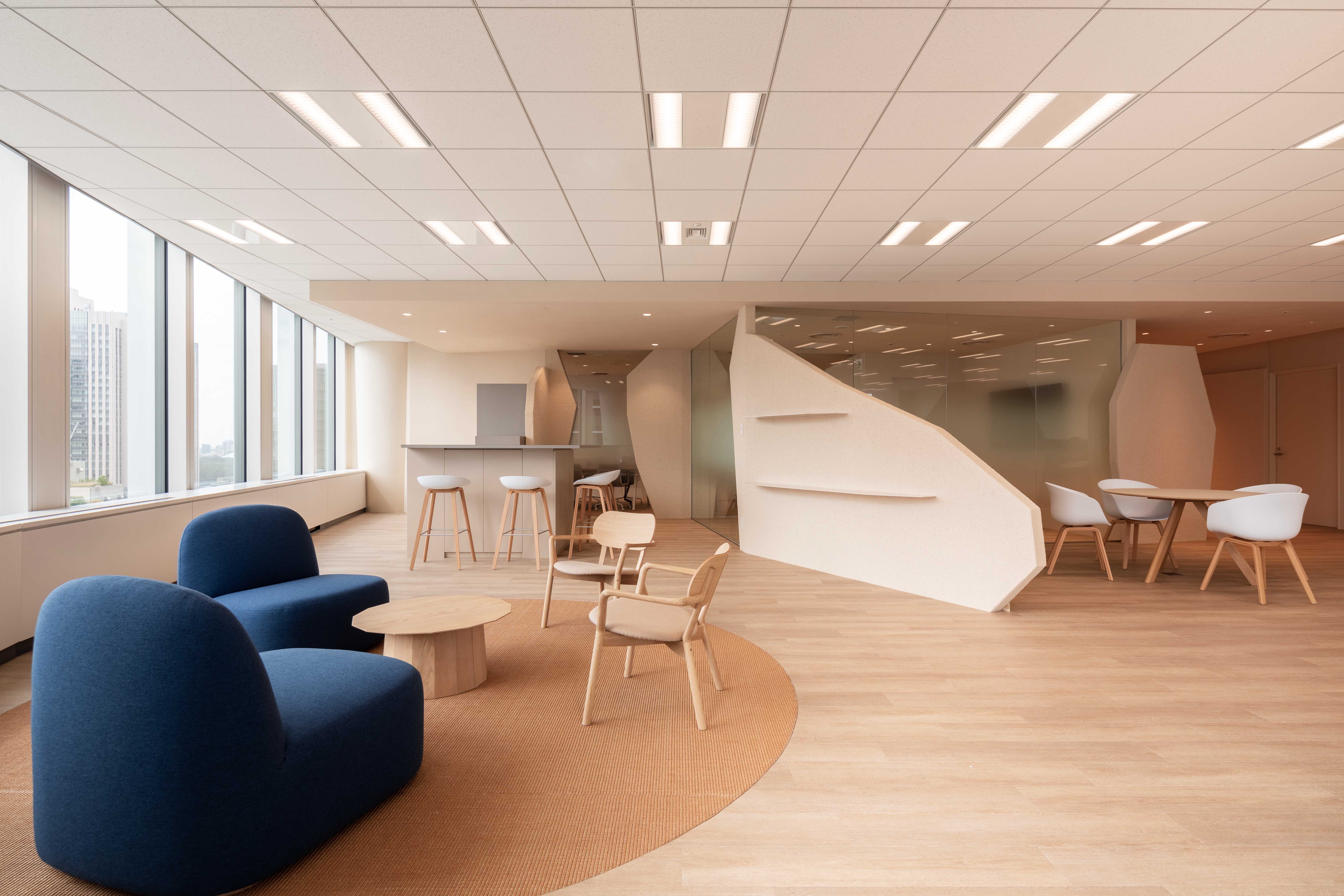
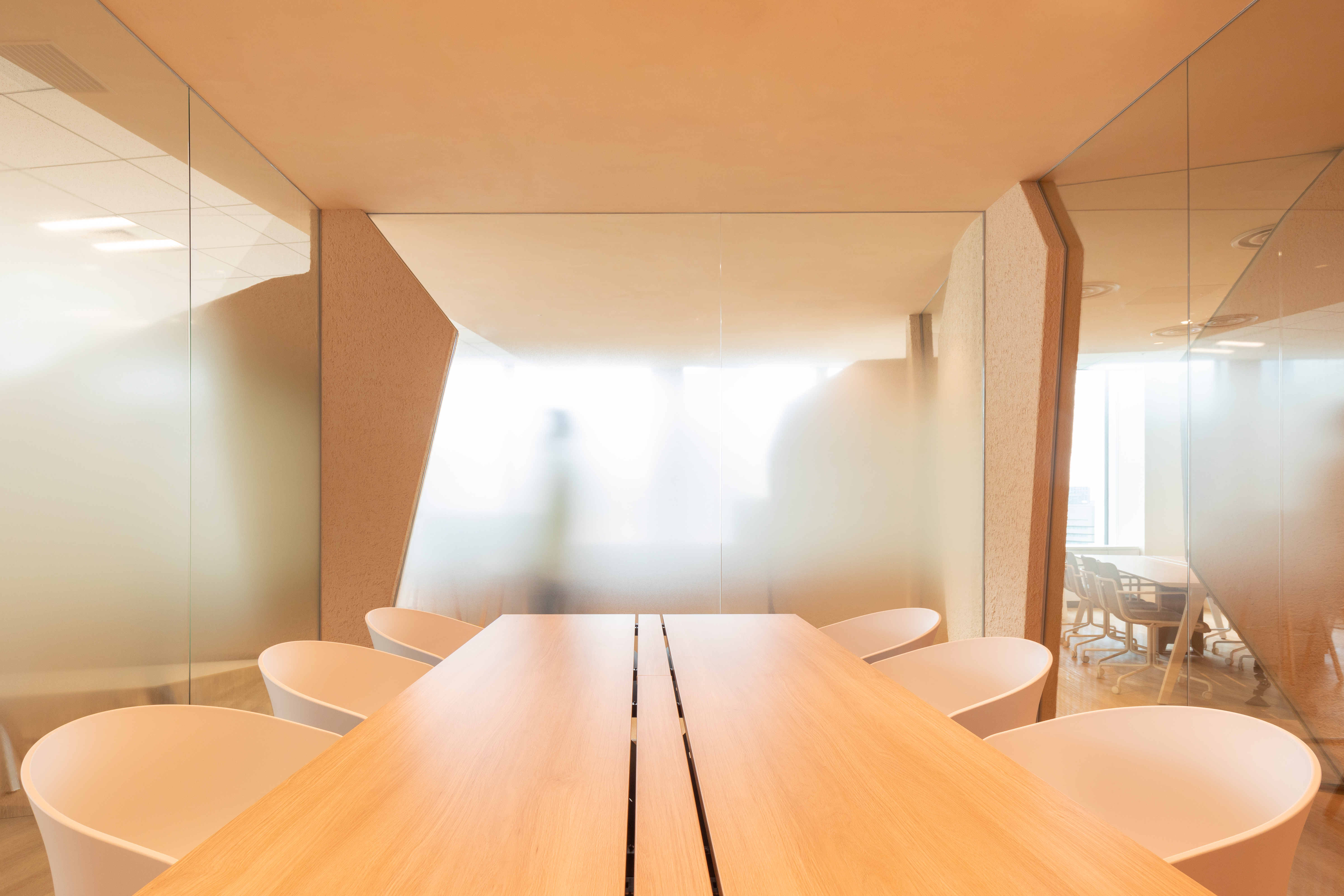
We suggested using a very light colour palette. Throughout the whole space, we installed a light wood oak floor. We used light cream coloured, thick, rough and smooth stucco finish for wall surfaces. Especially the rough stucco diffuses the daylight beautifully.
2. Views:
When we entered the new space for the first time we felt that the views of this relatively small office gave so much character to the space that we wanted to make sure that even after we constructed the programmatic needs such as meeting rooms, storage room, the space would not lose its openness that we felt so strongly during our initial visit.
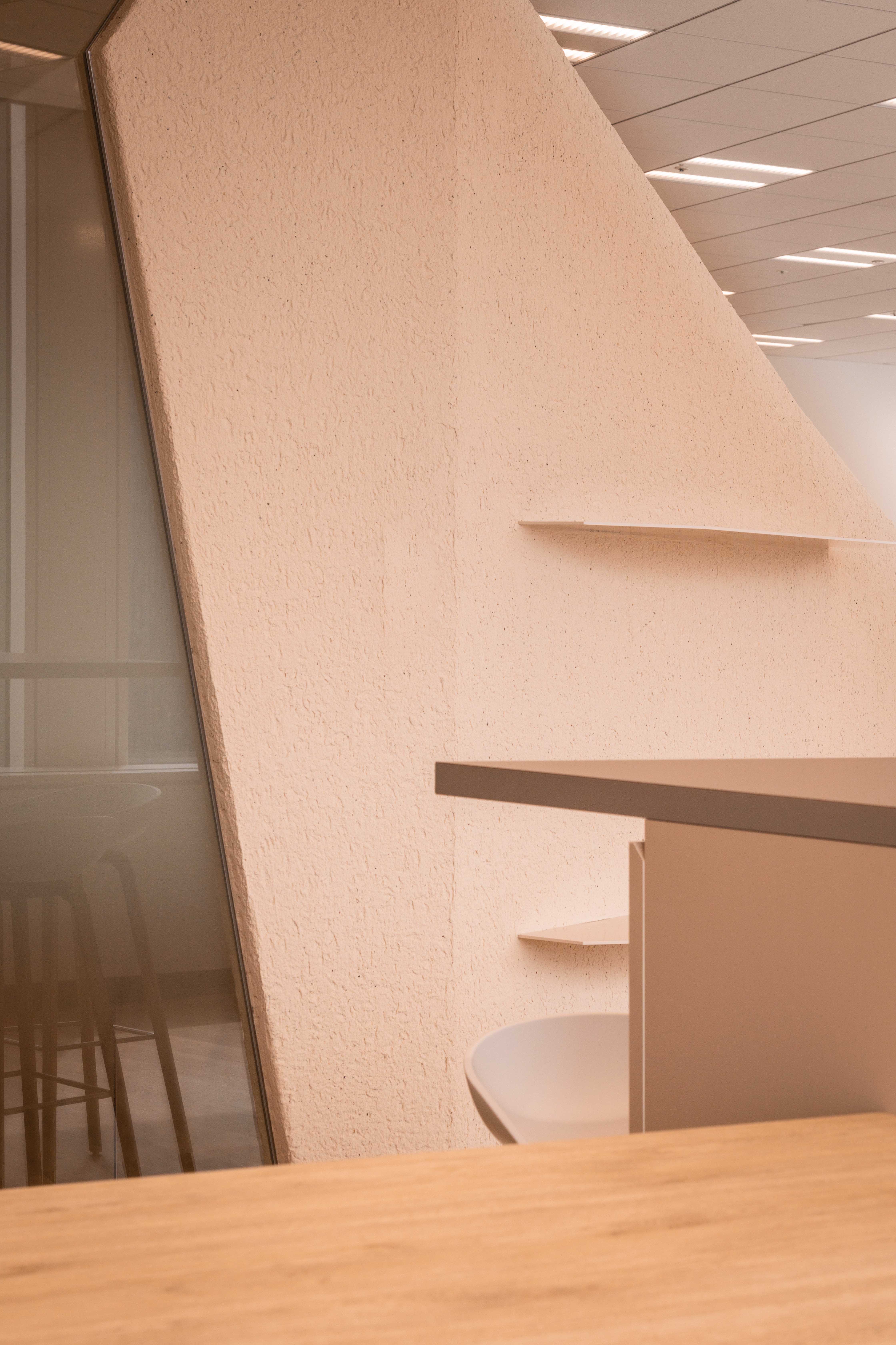
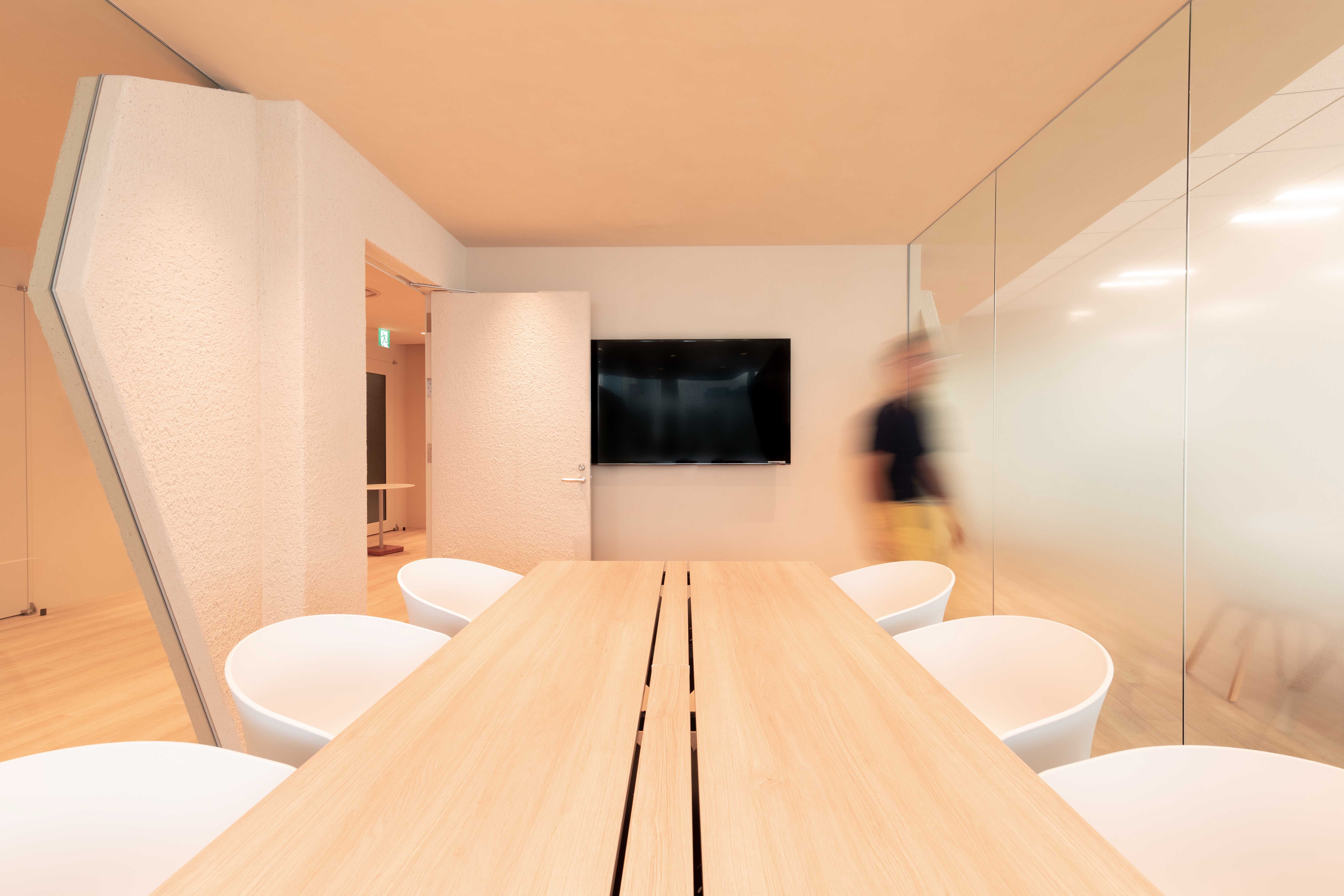
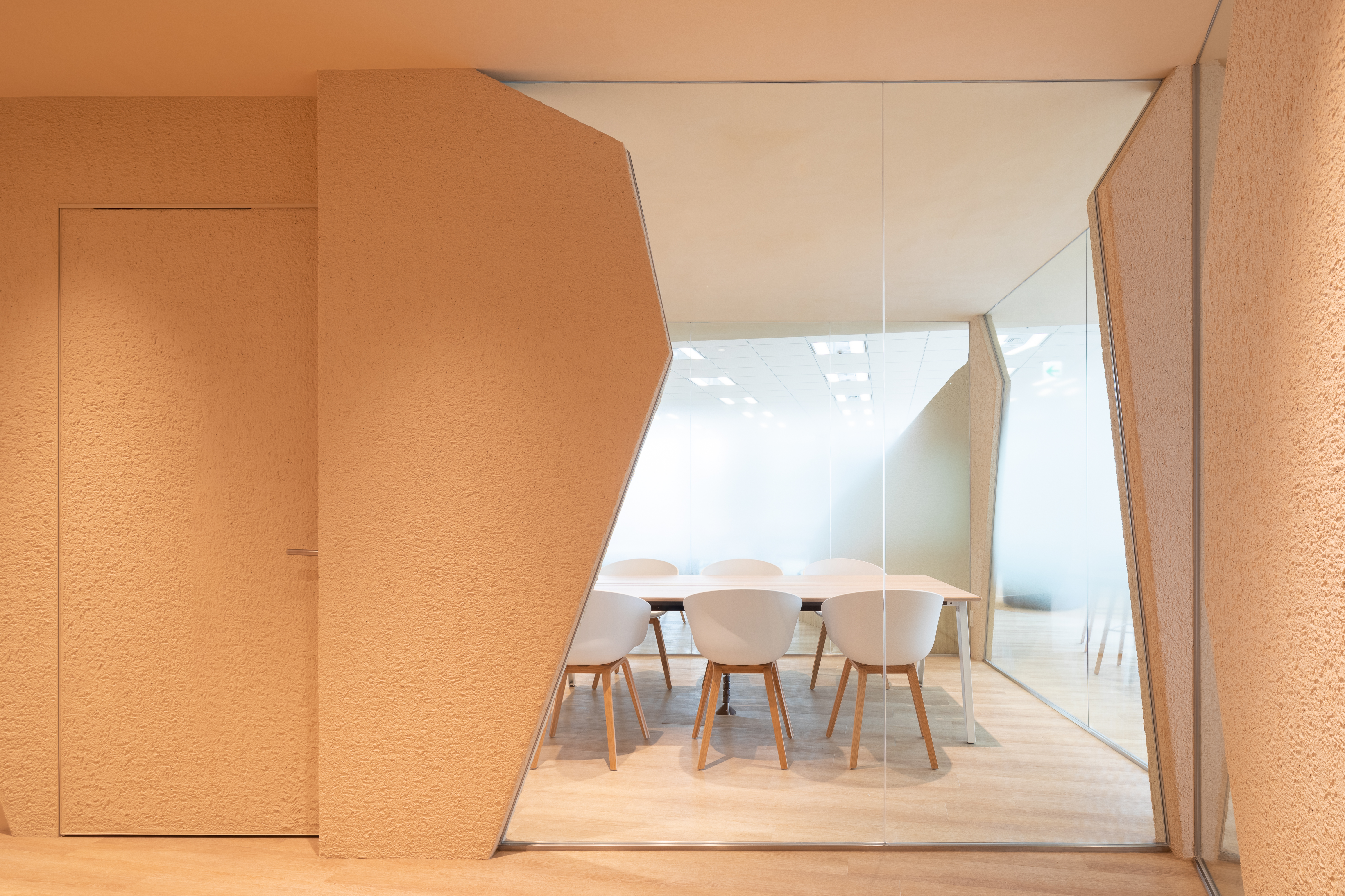
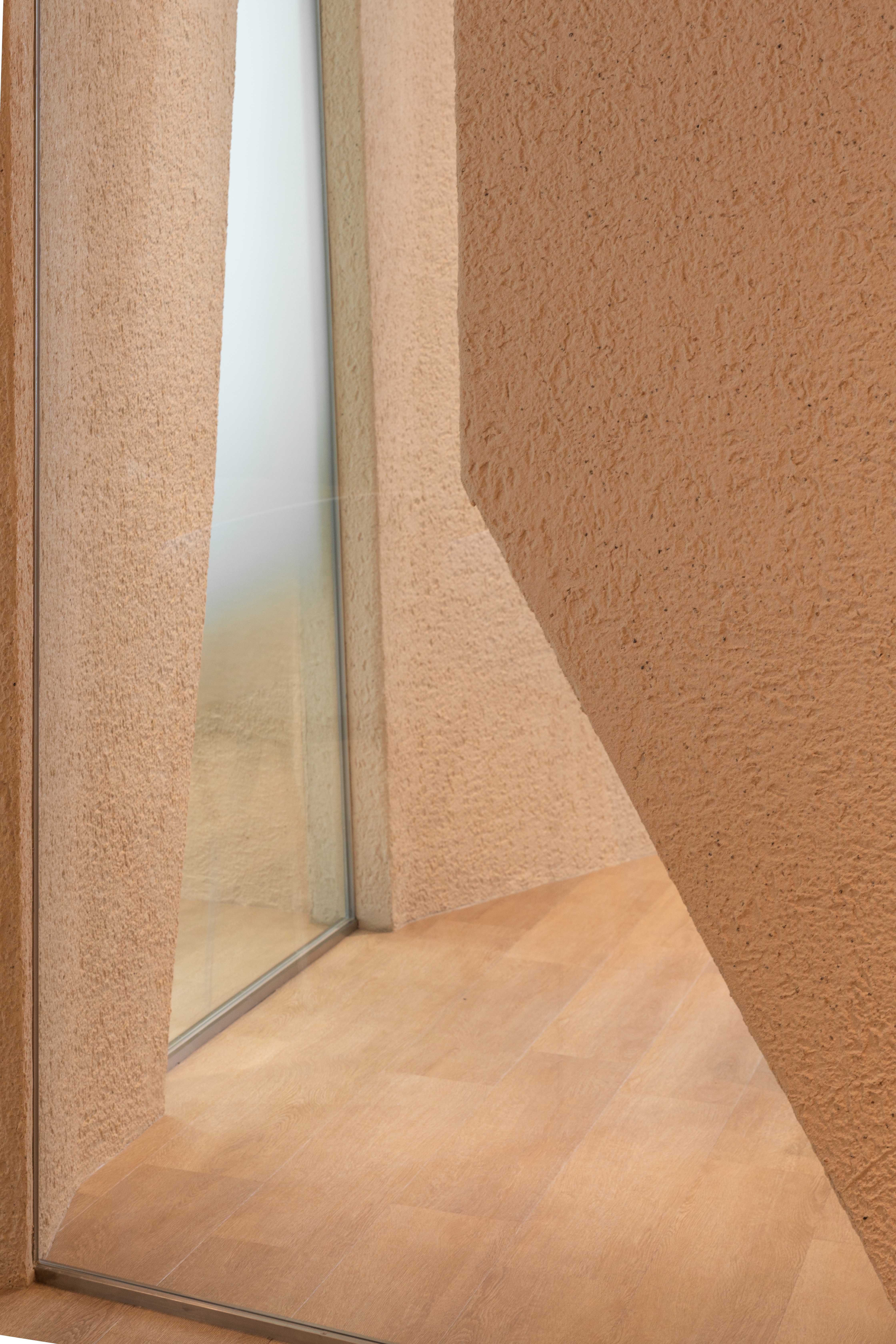
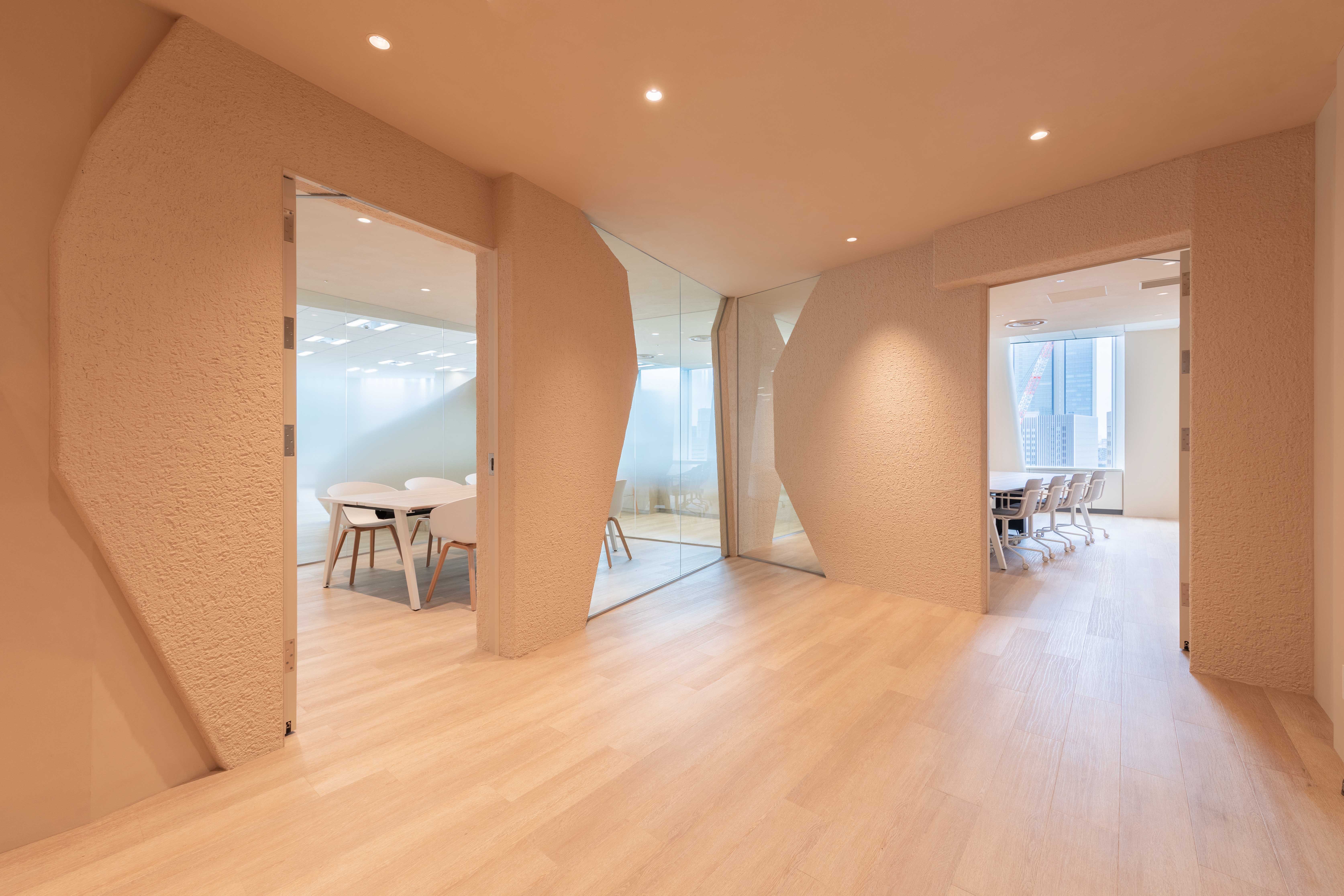
3. No Walls:
Thus we tried to keep the space as open as possible. To keep this sense of openness we tried to avoid, wherever possible to have any fully enclosed room. Instead, we placed angled objects made of rough stucco in the space and filled these in with glass. These walls then spatially project that sheltering feeling of enclosure off it without really creating a room. By cutting parts of these walls off at the bottom or their top we played with the leftover spaces in between these open enclosures. By moving through the space, even very slightly the negative space between these walls would change depending on the angle viewed of this in-between open space. As such one never gets the feeling of being inside a room, as depending on the location within this space there are always views taking the viewer beyond that room.
4. Sail & Rock:
These enclosures form shapes that would maybe remind the users and visitors of rocks or sails on a shimmering sea. At least that is the impression we have tried to convey with those shapes.
Conclusion:
We believe that these four elements created an office that programmatically fulfilled the needs of a hybrid post-covid office in which staff could come to the office to be inspired. While in the office the movement through the space would be part of the inspiration that we aimed to transmit: that as there is no real enclosed space but that the various viewpoints and the diversity of these viewpoints together with the changing daylight throughout the day would make the space feel alive, ever-changing.
We translated these requests around 4 conceptual keywords which would form the basis for the design.
1. Bright:
We suggested using a very light colour palette. Throughout the whole space, we installed a light wood oak floor. We used light cream coloured, thick, rough and smooth stucco finish for wall surfaces. Especially the rough stucco diffuses the daylight beautifully.
2. Views:
When we entered the new space for the first time we felt that the views of this relatively small office gave so much character to the space that we wanted to make sure that even after we constructed the programmatic needs such as meeting rooms, storage room, the space would not lose its openness that we felt so strongly during our initial visit.
3. No Walls:
Thus we tried to keep the space as open as possible. To keep this sense of openness we tried to avoid, wherever possible to have any fully enclosed room. Instead, we placed angled objects made of rough stucco in the space and filled these in with glass. These walls then spatially project that sheltering feeling of enclosure off it without really creating a room. By cutting parts of these walls off at the bottom or their top we played with the leftover spaces in between these open enclosures. By moving through the space, even very slightly the negative space between these walls would change depending on the angle viewed of this in-between open space. As such one never gets the feeling of being inside a room, as depending on the location within this space there are always views taking the viewer beyond that room.
4. Sail & Rock:
These enclosures form shapes that would maybe remind the users and visitors of rocks or sails on a shimmering sea. At least that is the impression we have tried to convey with those shapes.
Conclusion:
We believe that these four elements created an office that programmatically fulfilled the needs of a hybrid post-covid office in which staff could come to the office to be inspired. While in the office the movement through the space would be part of the inspiration that we aimed to transmit: that as there is no real enclosed space but that the various viewpoints and the diversity of these viewpoints together with the changing daylight throughout the day would make the space feel alive, ever-changing.
この運送会社は私たちに、今までとは違ったオフィスを期待していました。彼らは10 年後も新鮮に見える未来的なオフィススペースを求めていました。これらの要求を、デザインの基礎となる 4 つの概念的なキーワードにまとめてご提案しました。
1.明るさ:
非常に明るいカラー パレットを使用することをお勧めしました。空間全体に、明るいオーク材の床を設置しました。壁の表面には薄いクリーム色の厚い粗めのスタッコを仕上げとして使用しました。粗いスタッコは日光を美しく拡散します。
2. ビュー:
初めて新しいスペースに入ったとき、この比較的小さなオフィスからの眺めがこのスペースに非常に多くの特徴を与えていると感じました。この解放感を失わないように会議室、ストレージなどを配置しました。
3.壁がない:
私たちはスペースをできるだけオープンに保つように提案しました。この開放感を維持するために、可能な限り個室を持つことを避けようとしました。代わりに、粗いスタッコで作られた角度の付いたオブジェクトをスペースに配置し、ガラスで埋めました。これらの壁で仕切られた空間は
個室のように閉鎖的な空間ではなく、また全く解放された空間でもなく、半個室のような囲まれた集中できる空間になっています。
これらの壁の一部を下または上から切り落とすことで、空間に遊びの要素を加えました。空間を移動することで、壁と壁の間のネガティブな空間は、この中間の空間を見る角度によってわずかに変化します。部屋の中にいるという感覚ではなく、空間内の場所が変わっても、その部屋の向こう側に見る景色があり、空間につながりを感じられます。
4.セイル&ロック:
これらの囲まれた空間は、使用者や訪問者にきらめく海の岩や帆を思い起こさせるような形をしています。私たちはこういった表現でこの空間を提案しました。
結論:これらの 4 つの要素により、コロナ後に変化する社会にも対応できる、社員のための新しいオフィスの形を提案することができました。オフィスにいる間、空間を移動することは、私たちが伝えようとしたイメージの一部です。つまり、実際に囲まれた空間は存在しないため、さまざまな視点があり、1 日を通して変化する日光と相まって、空間は常に変化し、生きているように感じます。
TY Apartment
AN APARTMENT REFURBISHMENT


Client : Private Client
Location : Suginami-ku, Tokyo
Program : Residence
Area : 230m2
Scope : Design, PM
Status : Built
Photos : Vincent Hecht
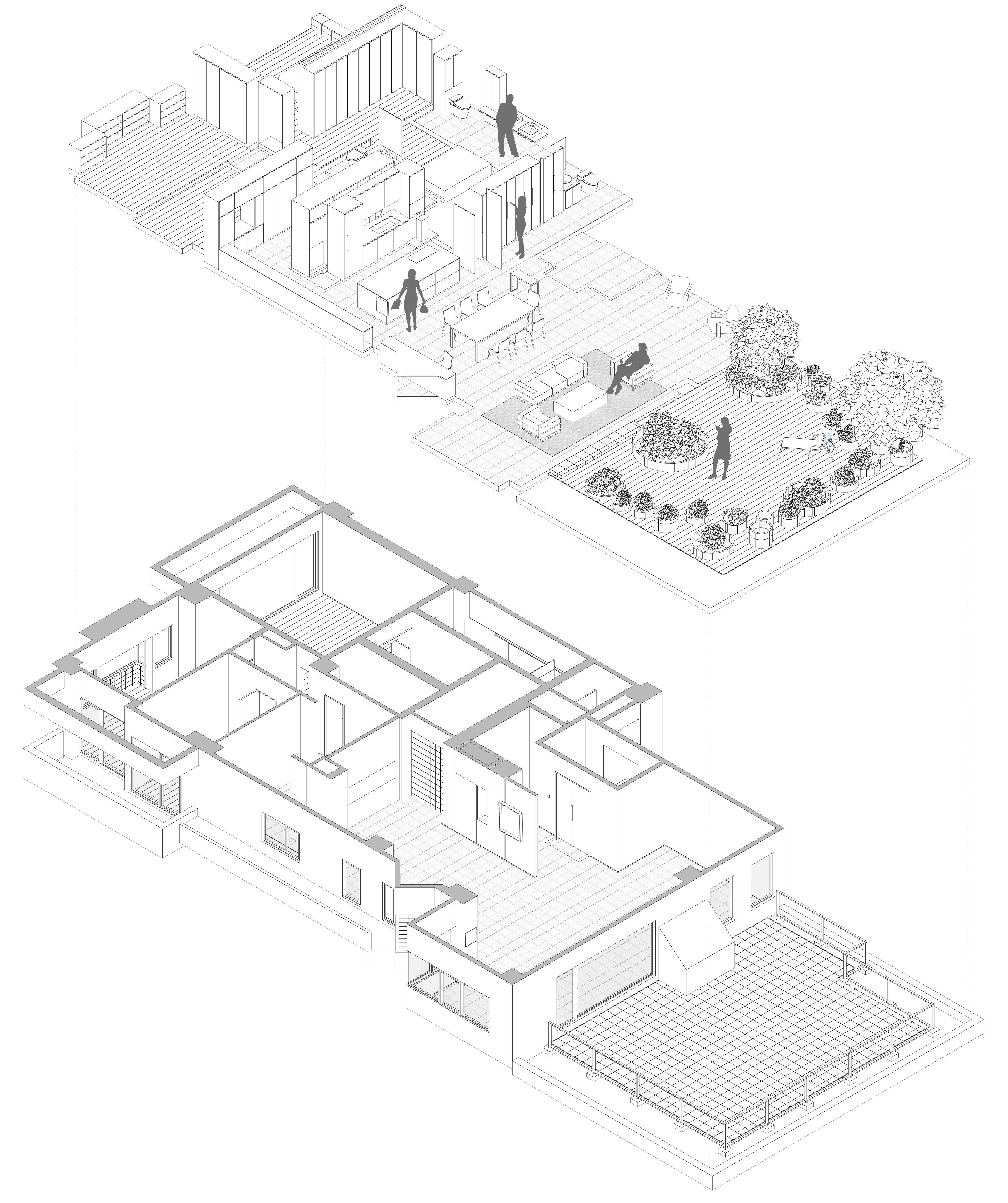
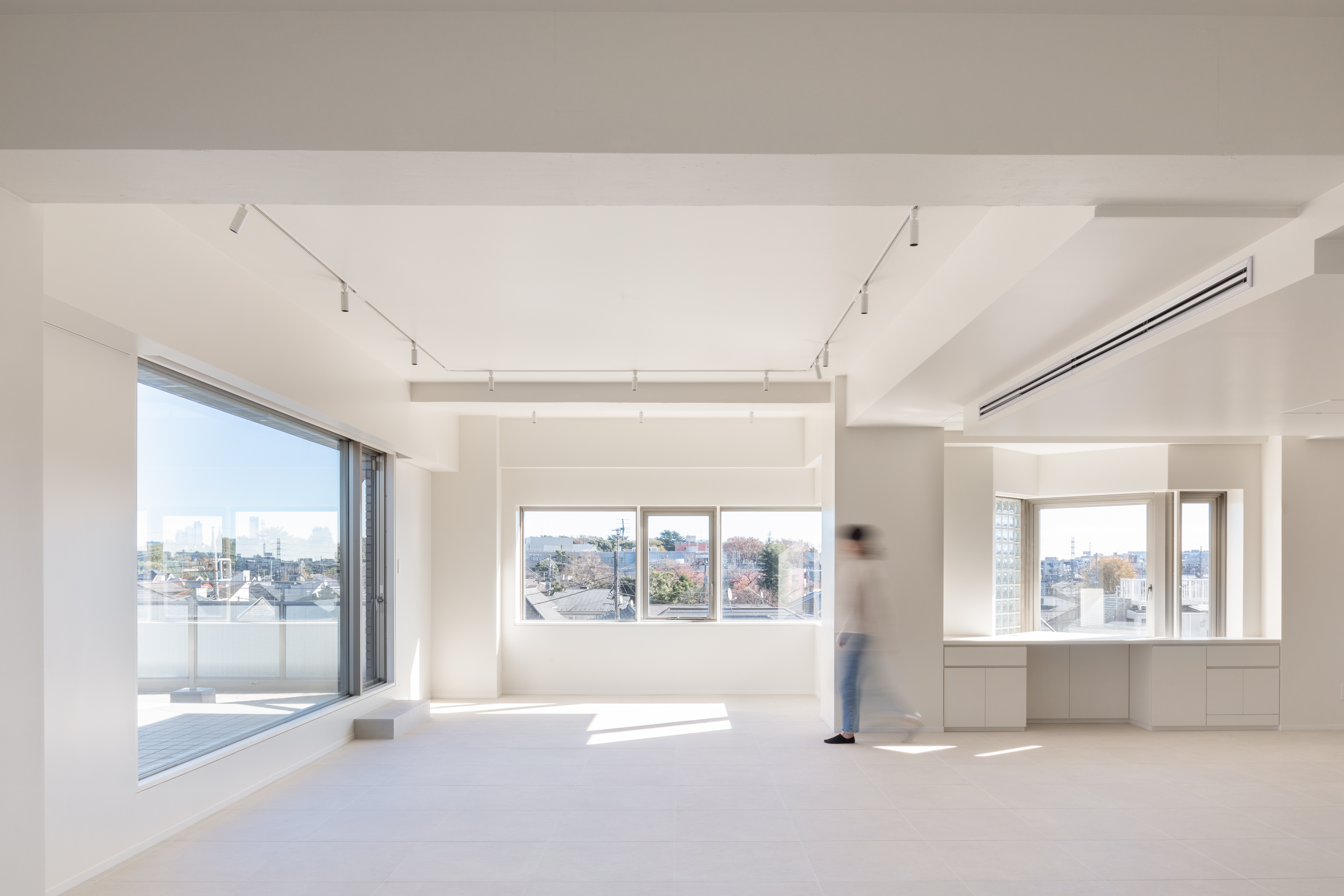
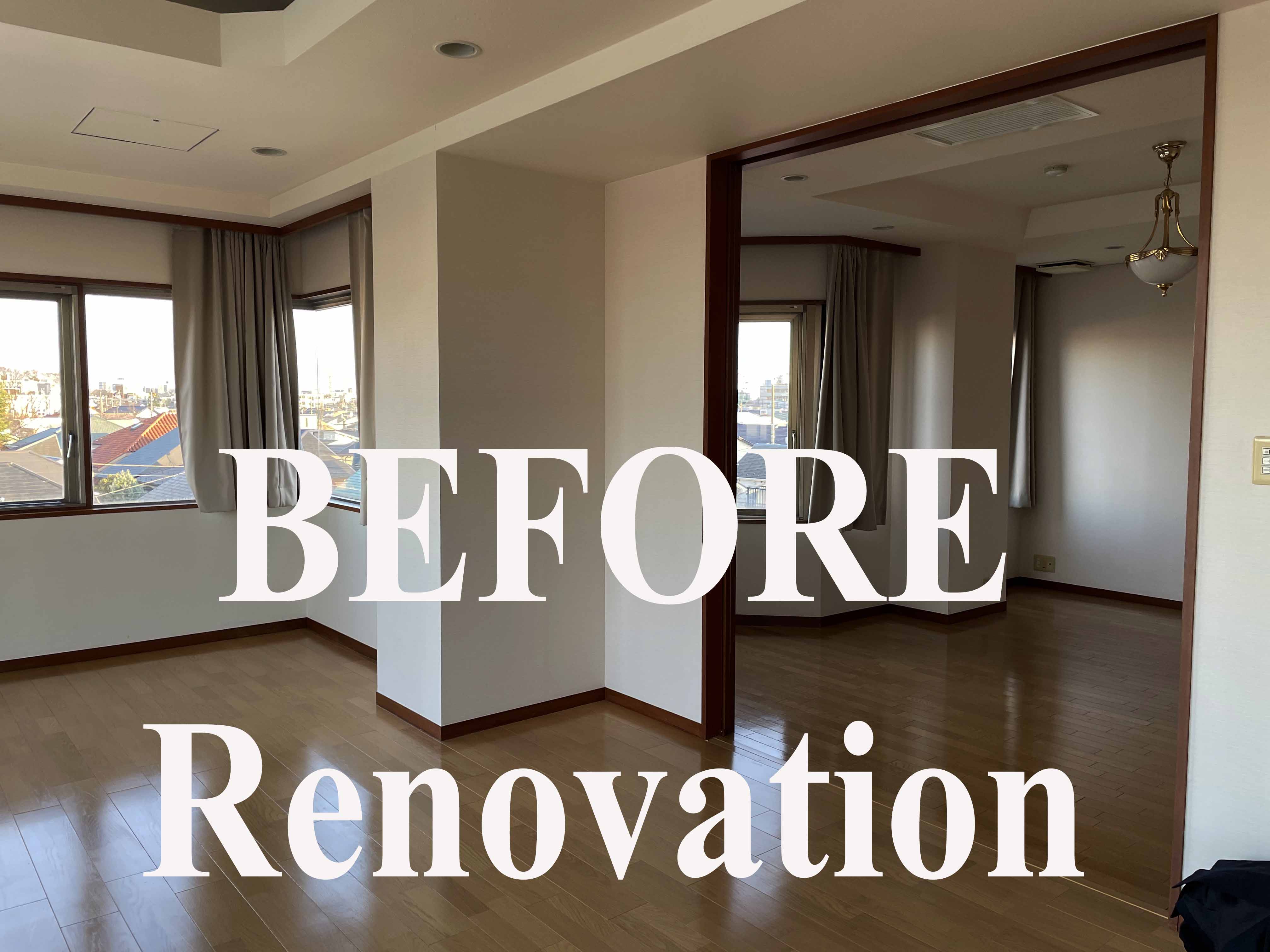
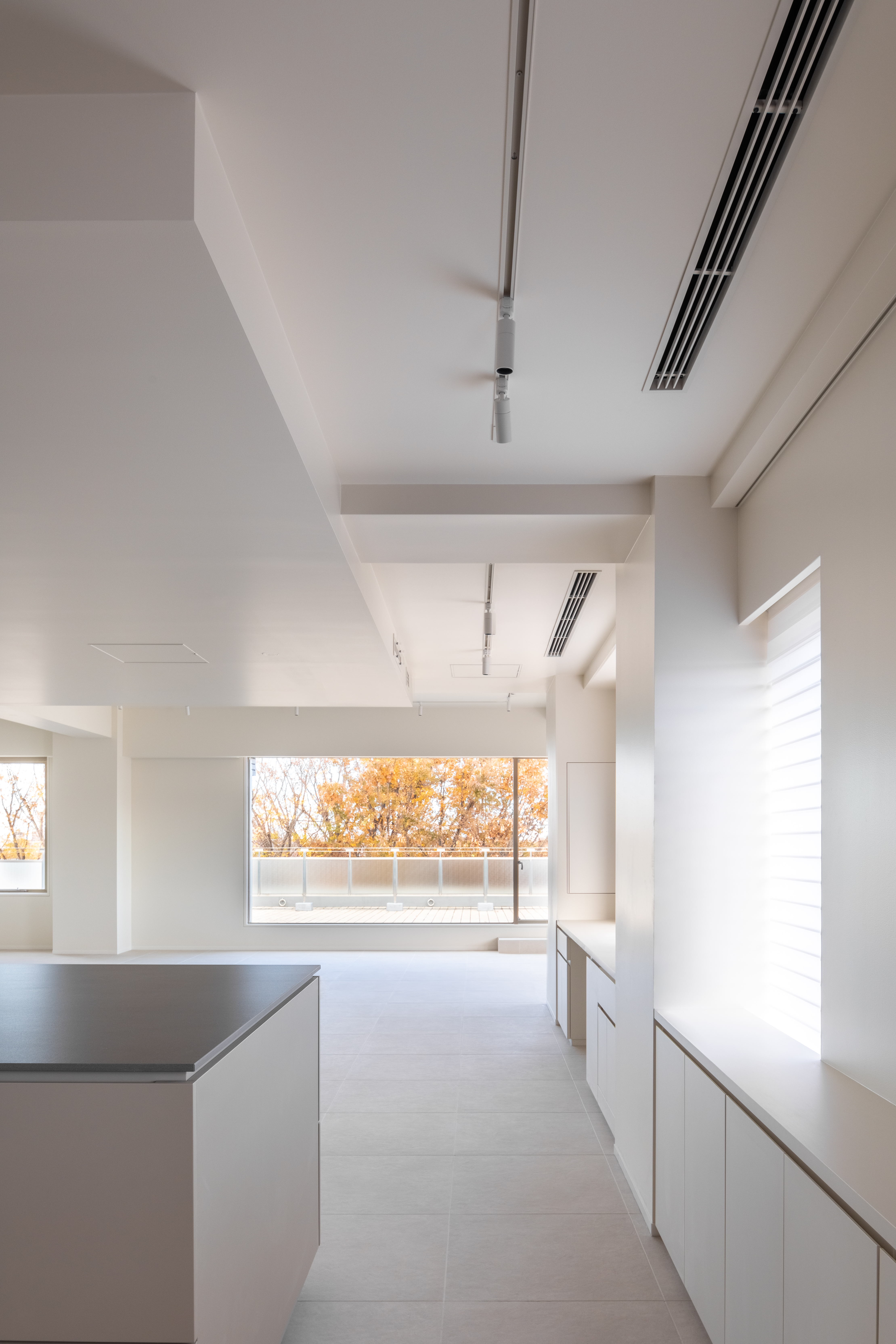
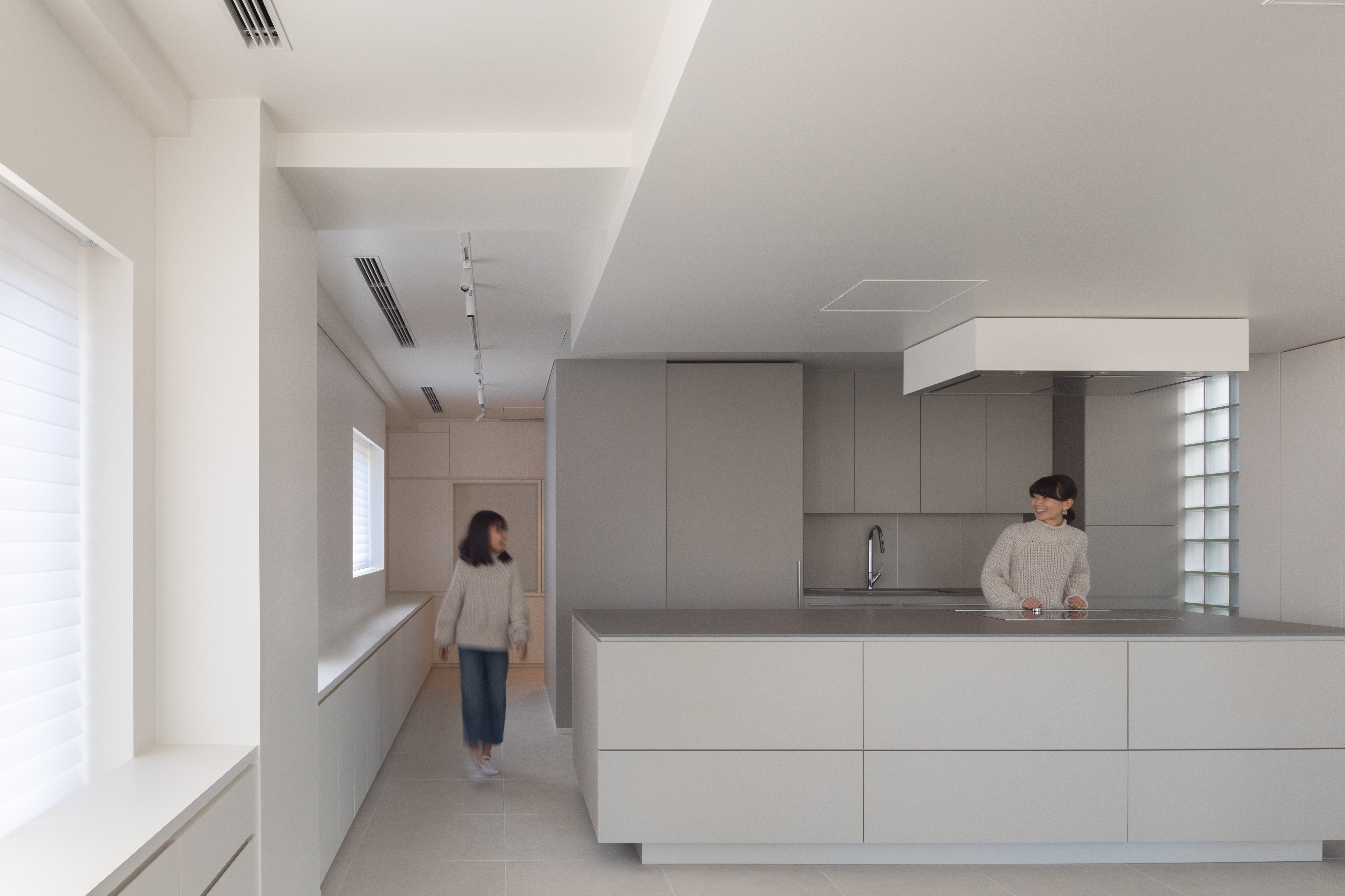
A renovation project of a 30-year-old apartment in the Western suburbs of Tokyo. The apartment had been unoccupied for over 10 years and the client requested a complete overhaul. The apartment complex consists of several relatively large units around 200m2.
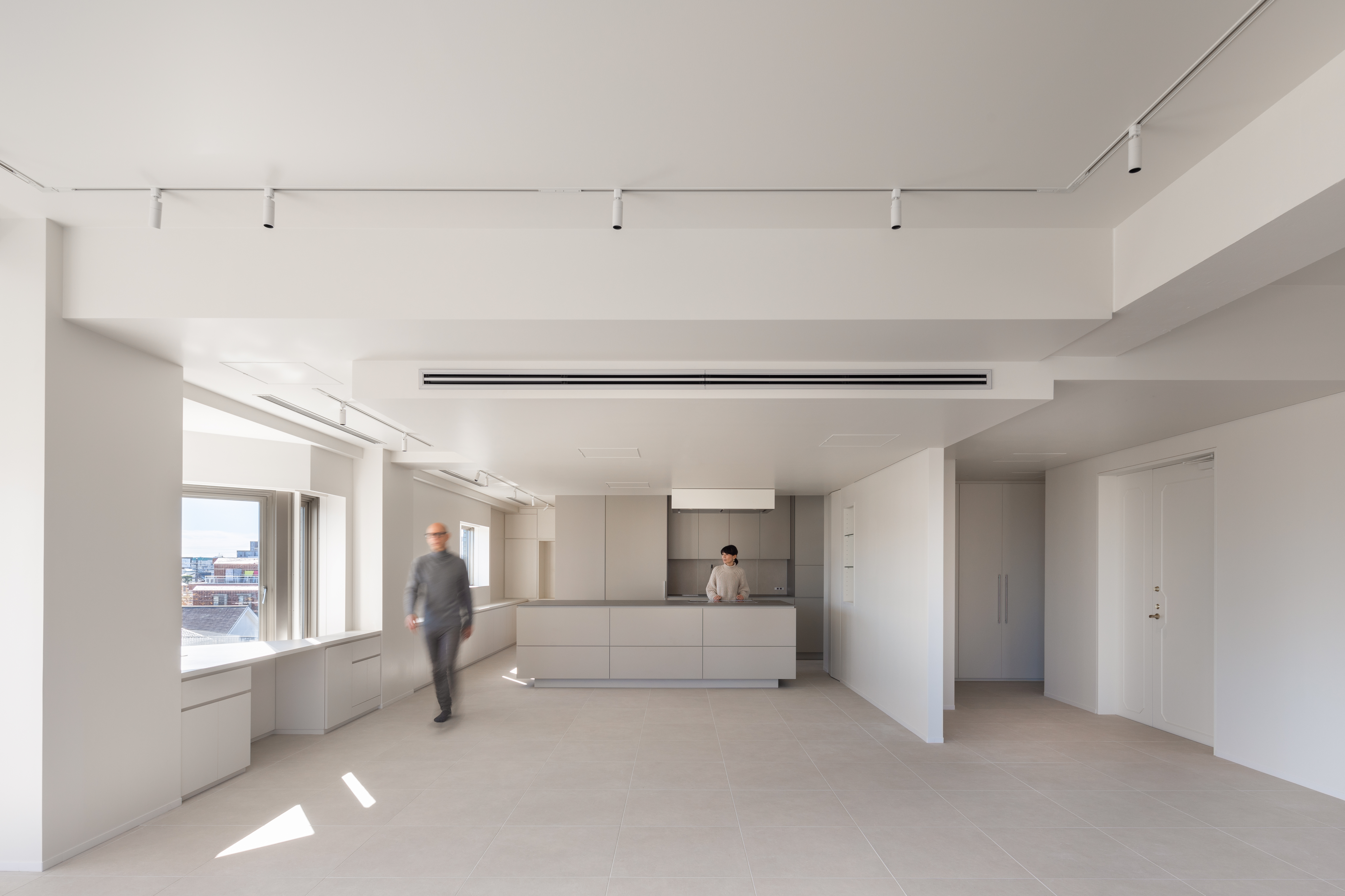
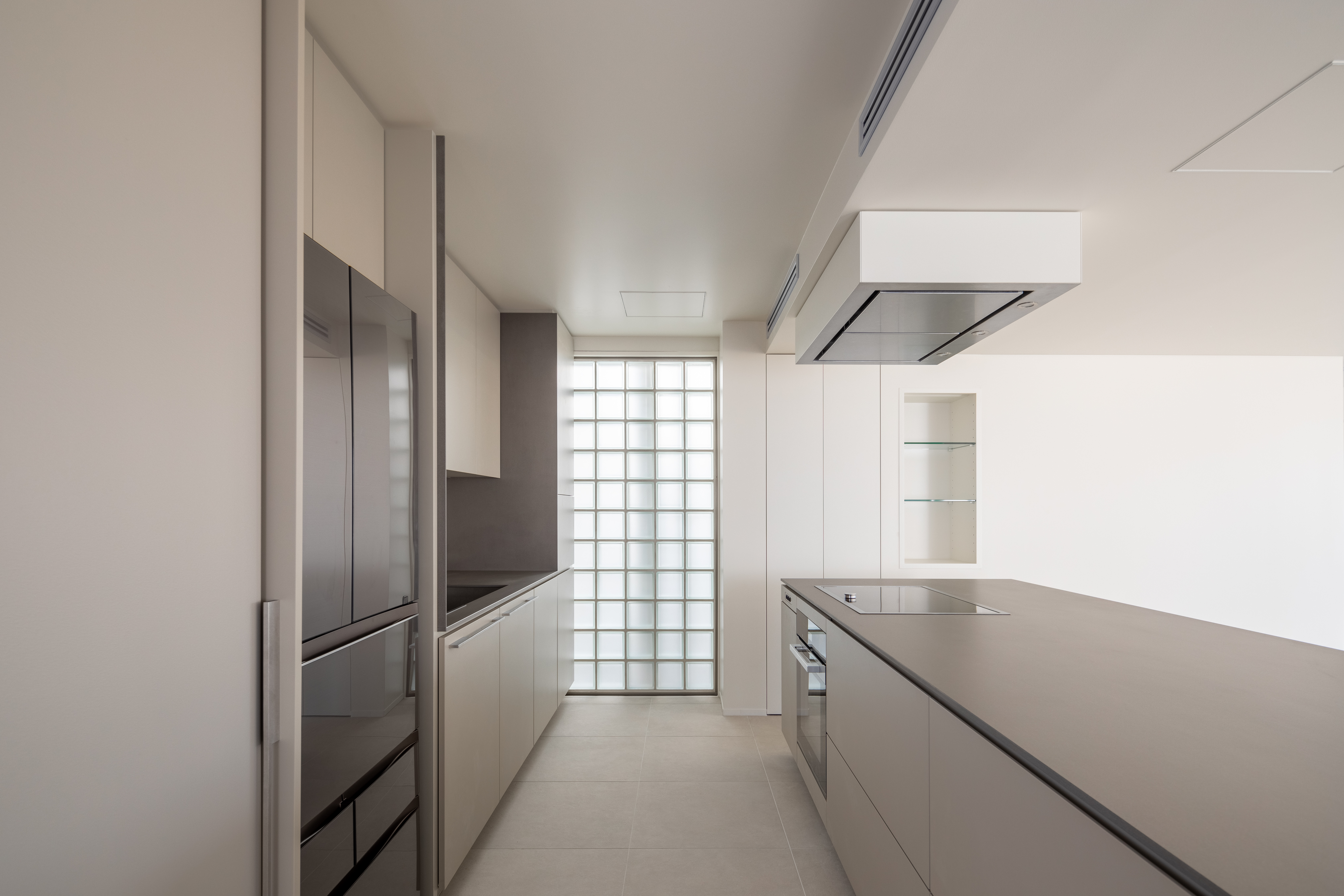
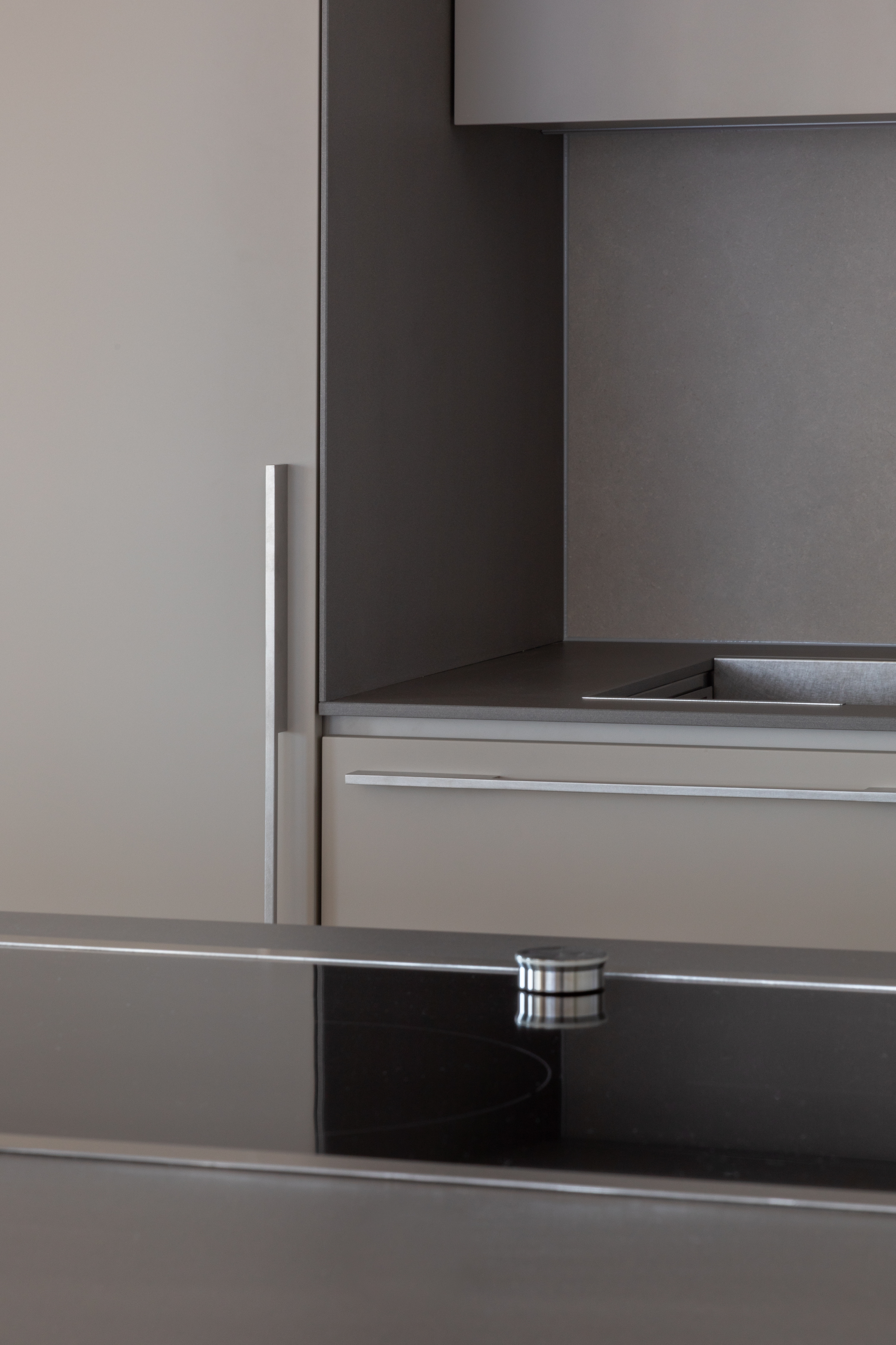
We started the design by trying to open up the space as much as possible. We removed the corridor and opened the kitchen which previously awkwardly squeezed along the facade. As such a lot more daylight could enter the space. We opened up the entrance by cutting the wall towards the living room and also removed two more walls of what used to be the dining room and storage closet. This created a much larger open combined living-dining area. The custom-designed new kitchen island provides a low barrier while also connecting the kitchen to the living area. We added more height by removing the ceiling but lowered the ceiling above the kitchen dining area to integrate the new air conditioning ducting as well as to spatially accentuate the dining area.
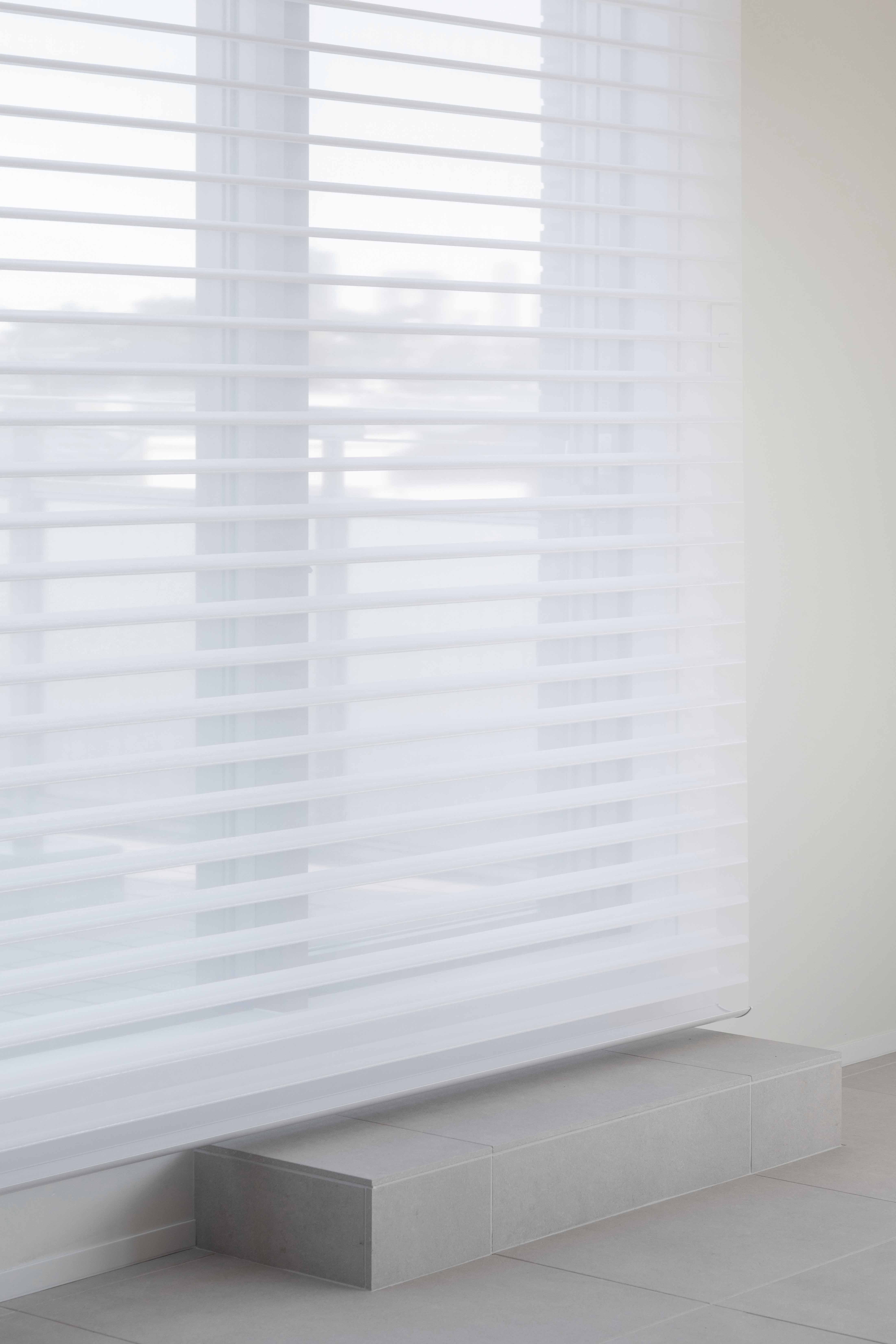
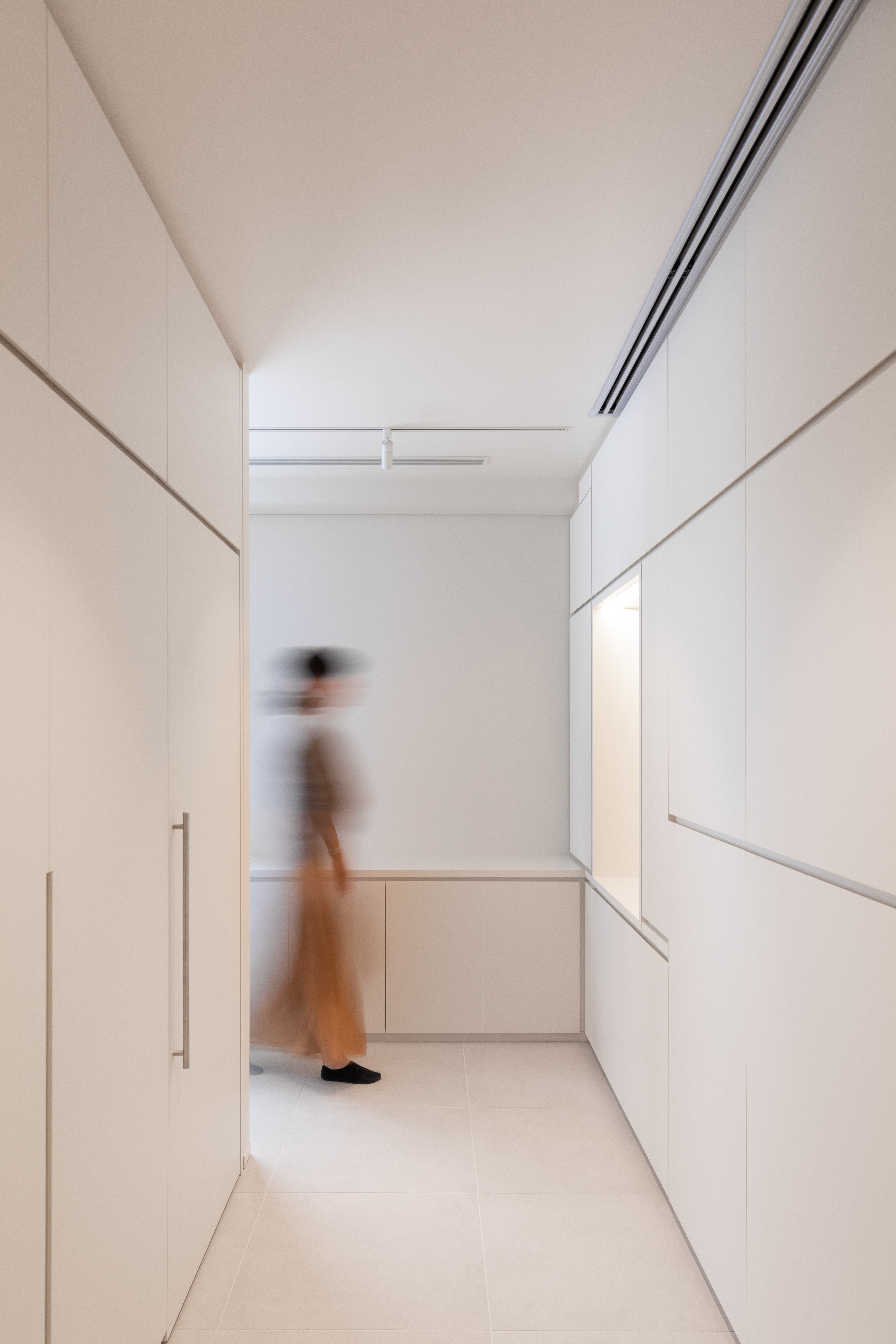
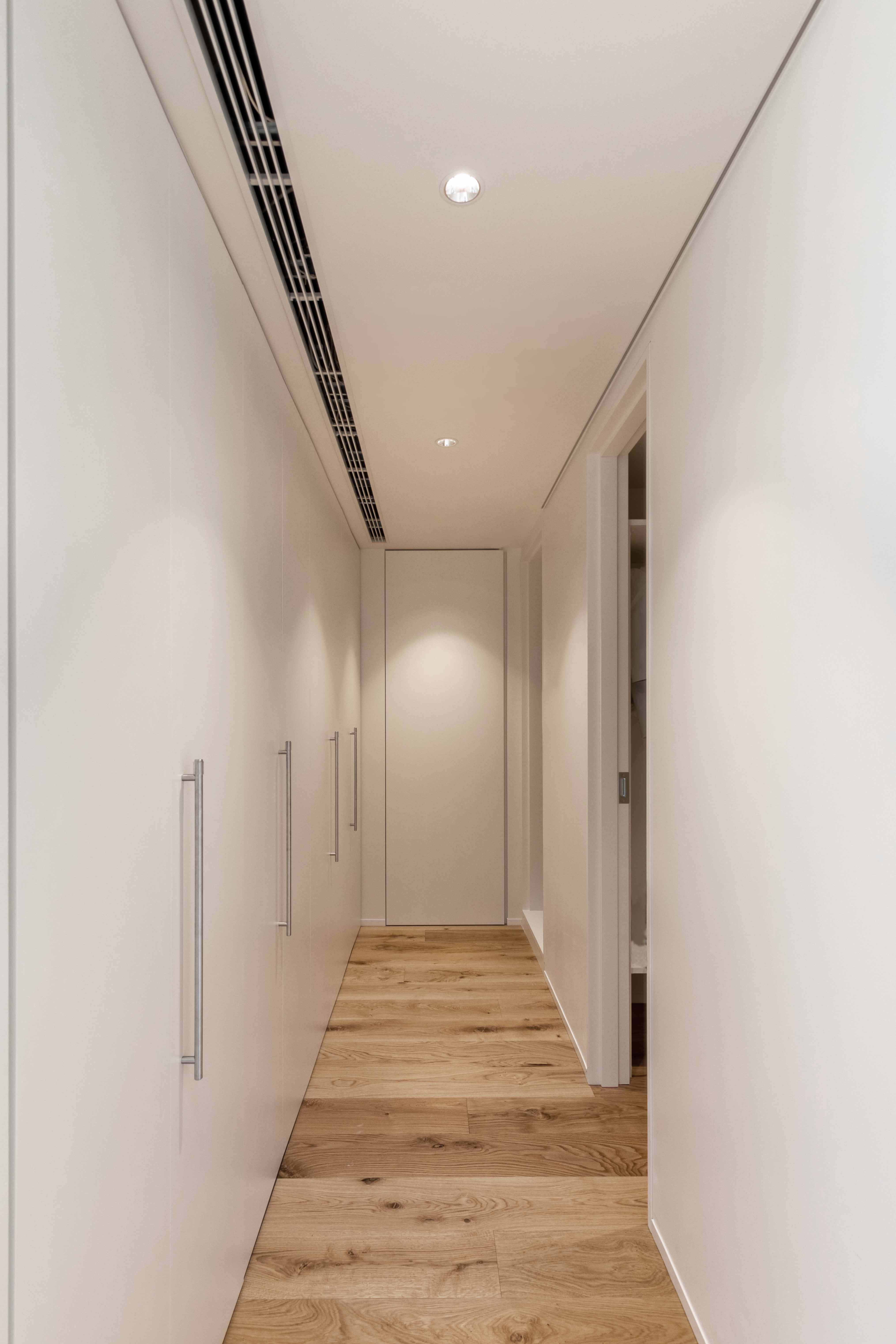
A new, open passageway to the bedrooms was placed along the facade. Storage was added below the windows. More storage was added where the corridor turned behind the kitchen towards the bedrooms. The corridor thus creates also space on either side for the washing machine, dryer and a full-height kitchen pantry storage. An alcove was left within this storage unit for a large antique statue. Automatic blinds were integrated within the walls allowing us to add a layer of insulation. A new floor was installed and due to recently implemented, stricter regulations which imposed a raised acoustical underfloor to absorb contact noise as much as possible. The client opted for a large 600mm square Italian tile under which floor heating was placed. For the bedrooms, light oak floors were installed.
The previous master bathroom with a minuscule sauna was demolished and replaced with a custom-built shower room. Here handmade Italian tiles were installed on the floor and walls. Part of the sauna space was integrated into an enlarged walk-in closet. All furniture was custom designed and as much as possible integrated within the interior space.
東京西部郊外の築30年マンションのリノベーションプロジェクトです。 10年以上空き家だったマンションを、お客様から全面リフォームのご依頼がありました。集合住宅は、約200平米/戸の比較的大きなユニットで構成されています。
スペースをできるだけ開放することから設計を始めました。私たちは廊下を取り除き、以前はファサードに沿って閉鎖的だったキッチンをリビングダイニンング側に配置して開放的な空間としました。そうしたことにより多くの日光が空間に降り注ぎます。
リビング側の壁を切り取り、玄関を開放し、ダイニングと物置だった壁をさらに2枚とりました。そうすることで、さらに開放的なリビングダイニングエリアになりました。カスタム発注したアイランドキッチンは、目線を遮らずより開放的な空間を作り出します。天井を取り除いて高さを増やしましたが、キッチン ダイニング エリアの上の天井を下げて、新しい空調ダクトを設置し、ダイニング エリアを空間的に強調しました。
ファサードに沿ってベッドルームへ通じる廊下を配置、窓下と寝室に向かう廊下に収納を設置しました。したがって、廊下の両側には、洗濯機、乾燥機、さらに高いキッチンパントリー収納用のスペースも作成されます。この収納ユニットには、大きなアンティークのアルコーブが残されていました。自動ブラインドが壁に組み込まれており、断熱層を追加することができました。
マンション規約の遮音等級に沿って床下の音響を高くする必要がありました。床はクライアントのご希望で床暖房が配置された600mm角の大きなイタリア製タイルを選択し、ベッドルームには明るいオーク材の床が設置されました。
サウナを備えた以前のマスターバスルームは取り壊され、特注のシャワー ルームを設置しました。ここでは、手作りのイタリア製タイルが床と壁に取り付けられました。シャワールームを縮小し、一部をウォークインクローゼットに統合されました。すべての家具は室内空間に合うように特注で設計されています。